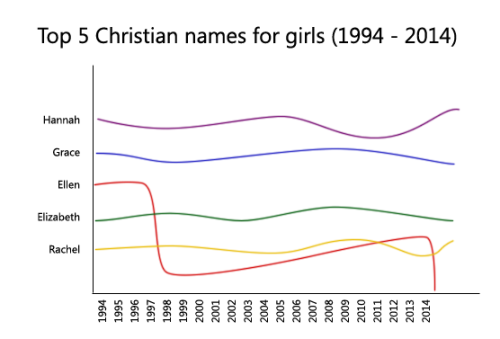
Ellen what the fuck happened in 1998
ellen degeneres came out in 1997yeah but ellen what happened in 2014
ellen page came out in 2014
Ellen is just a lesbian name face itI_wouldn’t_care_if_my_kid_was_gay.jpg
holy moses
Ellen what the fuck happened in 1998
ellen degeneres came out in 1997yeah but ellen what happened in 2014
ellen page came out in 2014
Ellen is just a lesbian name face itI_wouldn’t_care_if_my_kid_was_gay.jpg
holy moses
(via Chris Pine shows what it would be like if Congress was your co-worker / Boing Boing)
This is brilliant.


I’m going to miss you, B.
I am so grateful to have seen this man in office
Real tears rn 😭
END OF AN ERA

Boom
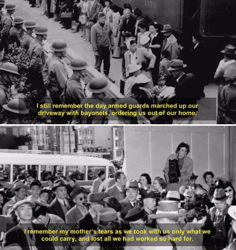
i have lost so many friends.
i don’t care if you “didn’t vote for his racist policies” because here’s the issue. new york city woke up to streets covered in swastikas.
i’mjewish. i’m a jewish woman who can no longer walk the streets without feeling like a world hates her. i don’t feel safe.
who you voted for makes me hate you. but it makes me think that you must hate me a whole lot more.
Client: Can we make the rectangle shape the same blue as the logo?
Me: Sure thing! I’ve changed the bar to the blue.
Client: Great. Now, can we put the logo on top of the bar?
Me: We COULD, but they’re the exactly same color.
Client: I know, it will match perfectly!
Client: I need an ad designed. 5” x 7”.
Me: So, 5” width 7” height?
Client: Yes.
I designed it and submitted. Three days later.
Client: I meant 5 x 7 the other way. Can you
just stretch it?

by Manuel

Architects and twin sisters, Luisa + Lilian Parrado have designed a geometric wall module to hold potted plants. Made of steel tubes strung together with polypropylene string, the components come with concrete shelves to rest your plants on. Use one module or several to create an irregular, three-dimensional composition of greenery for any wall.


Eran Naim and Ori Donitz, the duo behind En Design Studio, designed the interior of this five-room apartment in Israel that was purchased new. Located in a 21-story building, the apartment lacked character (as many new apartments do!) so they were asked to create a younger, unique flavor.

Beginning the project with shades of grey and white, they brought in color through furniture and details. The apartment lacked any separation between the entrance, main bedroom, and the kitchen, therefore, they decided to build a partition that incorporates shelving for additional storage and glass that still lets light pass through.

The kitchen was overhauled to avoid a sea of whiteness. They selected a black oven and hood to contrast the white cabinets and walls. Black stools and pendants give the space a cohesive feel.


In the kids room, a wall is covered with chalk paint for added fun.


Photos by Yoav Peled Architecture Photography / Peled Studios.

The Park Avenue Armory has been home to 80% of my most memorable art viewing experiences ever: Motorcycles that “draw”, indoor rain during Macbeth, an augmented reality “Last Supper”, and super-tall-swings that move giant white curtains. And now artist Martin Creed has taken over the entire space (including an area that regular visitors have never seen), with work that will make you smile, roll your eyes, and just appreciate the pointless joy of art that doesn’t need a reason.
The Armory itself was built in 1880 (or 51 years B.E.S.B. *Before Empire State Building) and features the “Wade Thompson Drill Hall”, a column-free MASSIVE 55,000 square foot room (for reference, a football field is 57,600 sq ft), plus a handful of beautiful and decaying 19th Century offices, including a “library” designed by Louis Comfort Tiffany. Yeah. It’s awesome.
Artist Martin Creed is British, in his late 40s and, as you will discover as you wander through this 20-year selection of his work, doesn’t seem to question the practicality, “intelligence,” or safety of any idea: he just fearlessly does whatever he wants. For example:

Work No. 2497: Half the air in a given space, 2015. Installation at Park Avenue Armory. Photo by author.
“Work No 2497: Half the air in a given space” is a room with hundreds of large white balloons that visitors are encouraged to enter. The first minute is pure bliss; the last minute is slightly panicked when you realize you have NO idea where you are or how to exit. The title image was shot by a professional, the above image is what it actually feels like.

Work No. 990, 2009. Installation at Park Avenue Armory. Photo by author.
“Work No: 990″ is a massive black theatre curtain that continuously opens and closes at the entrance of a hallway. It makes you feel like royalty, a late night host, or a bit like Indiana Jones as you wait for the perfect time to pass.

Work No. 569, 2006. Installation at Park Avenue Armory. Photo by James Ewing.
“Work No. 569″ is a piano that makes noise in a completely unexpected (and dangerous) way. It’s SO unexpected, that the materials are never described or listed as a “piano”, but instead as “wood, metal, and strings”. Every hour, the lid slams shut with a bang. Essentially it’s a really expensive clapper. I’m told it happens once an hour, but that exact moment is unlisted, so you will either be really surprised, or have to wait (I’ve missed it every time, but I hear it’s great). There is however, plenty to look at: It’s in the aforementioned Tiffany-designed room.

Work No. 2727: Lily Cole. Installation at Park Avenue Armory. Photo by James Ewing.
That massive football-field sized drill hall contains only two works: a large hanging video screen showing various women displaying the food they’ve been chewing in slow motion (more mesmerizing and humorous than it sounds), and a loading dock door in the back that automatically opens and closes between every short film, revealing the street outside. That “back door” is also the dirty-joke title of the entire exhibition.

Work No. 2721: Shutters opening and closing, 2016. Installation at Park Avenue Armory. Photo by James Ewing.

Work No. 798, 2007. Installation at Park Avenue Armory. Photo by James Ewing.
“Work No. 798″ is everywhere: diagonal stripes of black paint that vandalize every wall.

Work No. 142: A large piece of furniture partially obstructing a door.. Installation at Park Avenue Armory. Photo by author.

Work No. 2734, 2016 (roving musicians). Installation at Park Avenue Armory. Photo by James Ewing.
And this WHOLE time that you’re exploring the Armory, a marching band, complete with megaphone, continually roams the entire exhibition with a catchy, chaotic, and slightly-annoying-after-an-hour musical composition by the artist. I love it. In the image above, they’re marching around one of my favorites: “Work No. 142: A large piece of furniture partially obstructing a door.”

Work No. 160: The lights going on and off, 1996. Installation at Park Avenue Armory. Photo by author.
Yes the image above is blinking on purpose. It’s one of the earliest works in the exhibition “Work No. 160: The lights going on and off”, in which the lights in a room turn off and on every second. Inside that room is another work titled “Work No. 129: A door opening and closing.” Guess what that one does.

Work No. 1090: Thinking / Not Thinking, 2010
One of the most profound and beautiful (and offensive) areas of the exhibition is the video hall – A long dark storage hallway with low ceilings and exposed pipes that visitors rarely, if ever, get to access, which showcases Creed’s complete video work. One of my favorites, “Work No. 1090: Thinking / Not Thinking” is pictured above. With a couple of dogs running across a white stage to upbeat original music, it feels like a commercial without a product/brand at the end. Check it out here.

Work No. 1249: Dawning, 2015. Photo by author.
Above, in “Work No. 1249: Dawning”, a highligher traces lyrics of a song in perfect time. Enjoy the full video here. It’s about to be your favorite thing all day.
WARNING: The last three videos in the show have a strong parental advisory (and will absolutely not be pictured here). Fair warning: whether you find them shockingly offensive or funny, they will sear themselves into the back of your brain – running the risk of being the ONLY thing you remember when you exit. They include a giant nipple, an attractive woman defecating on a pristine white floor (for real), and another one vomiting. Love them or hate them, they are evidence again, that Martin Creed NEVER questions or edits ANY idea that pops into his head: he just does it. I left feeling inspired to do the same.

Work No. 792, 2007. Installation at Park Avenue Armory. Photo by James Ewing.
VIEWING TIPS:
The joy of this show is constantly wondering what is “art”, and what isn’t. For example: is the “Caution: floor slippery when wet” sign part of the show? (It’s not). Or are the random LEGO blocks in the trophy case a sculpture? (They are). It’s a fun feeling, so I recommend NOT reading the map that they hand you when you enter until you feel like you’ve seen everything. Then going back if you missed something… or discovering that your favorite piece of art wasn’t art at all.
Finally, when you’re 100% done, I recommend exiting the building and walking around the full block to see the “back door” from the outside. As it automatically opens and closes, other pedestrians are unaware, and it’s so dark that you can’t see anything inside – but stand and wave anyway, because you’re on view, and it will be hilarious.

The back door of Martin Creed’s “The Back Door” at Park Avenue Armory. Photo by author.
What: Martin Creed: The Back Door
Where: Park Avenue Armory, 643 Park Avenue, New York, NY
When: June 8 – August 7, 2016
Details: Admission is $15. Advanced Ticket Purchase recommended here.
All images courtesy Park Avenue Armory.
In the UK, only one in every 400 paper coffee cup is recycled. Starbucks is partnering with Frugalpac, a manufacturer of recyclable cups made entirely from recycled paper, to help combat this wasteful dilemma. The trial launched last week, possibly leading to the use of these Earth-friendly containers in franchises all over the world.
![]()

Frugalpac, founded by engineer Martin Myerscough, aims at providing a better alternative to conventional paper cups. Every year about 58 billion paper cups end up in landfills or are incinerated worldwide. Most cups involve paper treated with waterproofing chemicals, making them difficult to recycle. Frugalpac feature a thin, plastic liner lightly glued inside a 100 percent recycled paper cup. They claim recycling centers can easily separate the materials and recycle each on its own.
Related: Starbucks opens new reclamation drive thru made from recycled shipping containers
According to The Guardian, a Starbucks spokesman said, “We are very interested in finding out more about the Frugalpac cup and we will be testing it to see if it meets our standards for safety and quality, with a view to trialling its recyclability.” Myerscough is reportedly in contact with various coffee shops and grocers, which could lead to a revolutionary shift away from wasteful convenience to more environmentally-friendly libations.
Via The Guardian
Over 40 years ago architect Arthur Quarmby built Underhill for his family. From the United States to Australia to Japan, Underhill was widely cited as an example of the elegance of earth homes. The 4,000 square foot dwelling is described on the property listing as "the most celebrated house in the West Riding Section of the Peak District;" a description that would fit right in with Tolkien's description of the Shire. (Don't tell the Sackville-Bagginses or they might stop by to steal some spoons.)
Related: Tour the Tolkien-themed Hobbit Boutique Hotel in the author's South African birthplace
While the home is not overtly described as a hobbit hole, its name (Frodo Baggins hid under the surname Underhill for a time) and round features - namely a round door at the entrance - appear to evoke the beloved stories. Quarmby's family lived in Underhill for over 40 years with "unalloyed delight," but they're now selling it through Wm. Sykes & Son for a little over $900,000.
The four-bedroom home on close to one acre of property is located amid the green rolling hills of Holme, England. It centers around a "family recreation area" with a swimming pool, and around the pool are suites for the owners and two children. There's also a dining area, music room, guest bedroom, and kitchen. In a last hobbity touch, there's a "stone vaulted cave" where residents can enjoy a peat fire. Bilbo might be able to afford this home after battling a few more dragons.
Via CNET
Images via Wm. Sykes & Son


Save


Watch: George Takei sends a message in Spanish about how we can defeat Trump
George is doing such important work right now. I’m so grateful he’s speaking out.
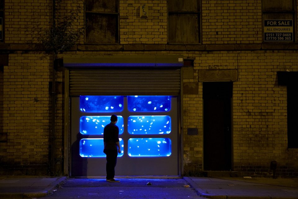
When an abandoned structure can’t be rehabbed in the traditional sense, whether due to practical constraints or simply becoming obsolete, it can be transformed for another purpose with paint, tape, lights and sculptural installations. Artists transform derelict buildings into public art, sometimes visible to lots of passersby and sometimes only to the urban explorers who might be curious enough to climb through a broken window.
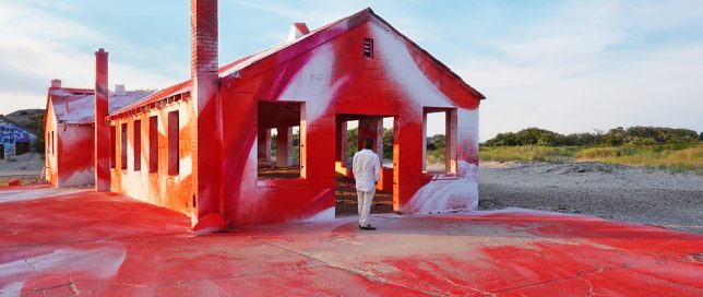
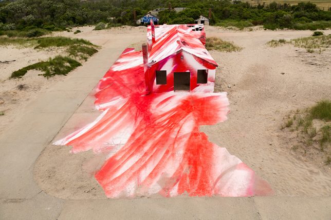
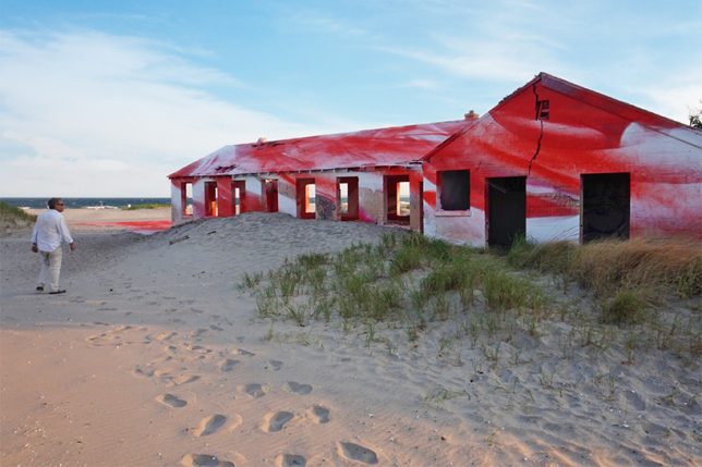
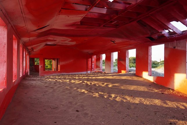
One of many abandoned military buildings making up Fort Tilden on the Rockaway Peninsula in Queens now spills red onto the surrounding sand in a site-specific installation by artist Katharina Grosse. The former aquatics building is highlighted inside and out in abstract crimson strokes meant to mimic the effect of a sunset in the Rockaways. The structure is set to be demolished in late 2016.
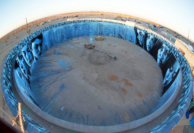
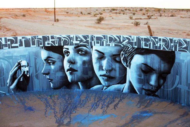
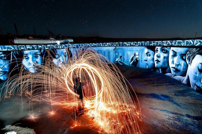
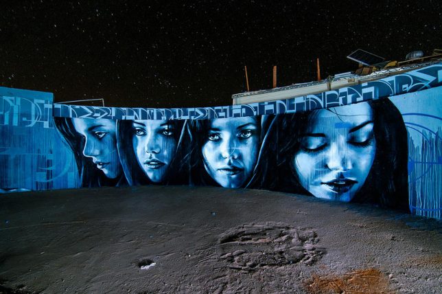
Only urban explorers curious enough to gain access to this abandoned water tank in Slab City, California will ever see this somber circular mural in person, climbing a staircase to the top of the tank to gaze inside. Artists Christina Angelina and Ease One create a starkly emotional contrast to the red and beige tones of the desert beyond the tank’s walls.
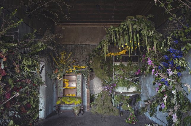

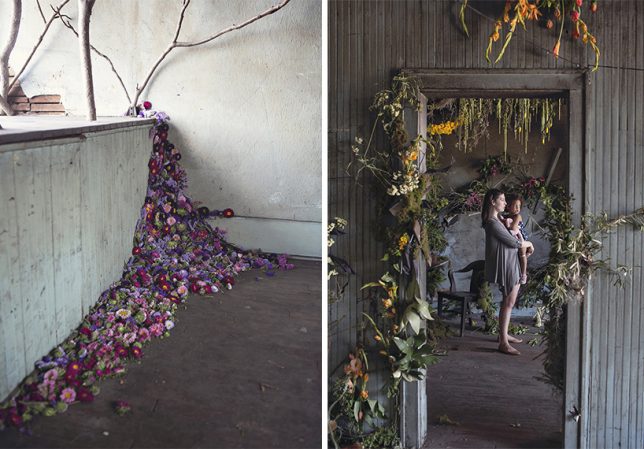

‘Flower House Detroit,’ conceived by Lisa Waud and realized with the help of florists from across the country, may be a temporary reclamation of an abandoned place, but it’s among the most striking installations for its contrast of life and decay. Each room had a different designer creating artful compositions of flowers, trees and even weeds, beautifying the space before it was deconstructed and repurposed. The land the neglected house stood on will be converted into a flower farm for Waud’s design business.
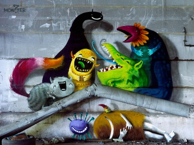
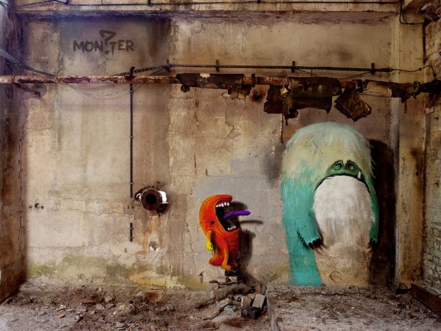
The idea of pairing monsters and abandoned buildings may sound like a nightmare, but German street artist Kim Köster makes both seem less scary with a series of fun paintings in Berlin. Choosing easily accessible public spaces as his canvas, the artist not only takes some of the fear out of dark derelict rooms in a physical sense, but also brings the to a much wider audience thanks to an interactive children’s picture book called Monzster.


Antes de que llegue Pokémon Go a Latinoamérica, podemos ver que en otros lugares ya las marcas se están subiendo al tren y muestran algunos anuncios sobre el ya muy popular juego.
#PokemonGo = Fitness and we’re taking it to the next level. Who needs some new #Zprint shoes to help ‘Catch em all?' pic.twitter.com/wkwMrwcDVO
— Reebok (@Reebok) July 15, 2016
Because #PokemonGO https://t.co/OyZwxQGdmt pic.twitter.com/3BOvz9DGR2
— Amazon (@amazon) July 11, 2016

If you're playing #PokemonGO then you should know, or bookshop is full of them! Come browse and catch them all! pic.twitter.com/cGC42naQa3
— Waterstones Walton (@WaterstonesWoT) July 11, 2016
Just another reason to come by #FuzzysTacoShop today. Thanks for the report, @MatthewGrant10. #PokemonGo pic.twitter.com/lYWNOEZQPN
— Fuzzy's Taco Shop (@fuzzystacoshop) July 11, 2016
We think Pokemon are like trains you've gotta catch 'em all! We've got Psyduck in the office…. #pokemongo pic.twitter.com/4DebN8Pqzz
— trainline (@thetrainline) July 11, 2016
Don’t Poké without one. #PokémonGo pic.twitter.com/rPkUYmMcqp
— Trojan Brand Condoms (@TrojanCondoms) July 12, 2016
Claro, también hablan sobre los peligros.

Practice responsible #Pokemoning Don't get lured to secluded places and never #Pokemon and drive. pic.twitter.com/Fv9NGsUt37
— PBSO (@PBCountySheriff) July 12, 2016
Train tracks are no place for #PokemonGo trainers; pls keep safe & stay behind the yellow line as you catch them all pic.twitter.com/syfr0caq1q
— T1 Sydney Trains (@T1SydneyTrains) July 12, 2016
__________________
Part architecture and part sculpture, BUS:STOP takes the humble transit hub to new heights--literally. Sou Fujimoto's bus stop, for instance, looks like an elevated roofless treehouse nestled within a white birch forest. While the other designs offer more protection from the elements, they are also artistic and unconventional.
Related: Tessellated Tree-Like Transportation Shelters Offer Unique Shade for Local College Students
In total, architects from seven countries and three continents were represented in the final designs. BUS:STOP was largely funded by private donors and the finished bus stops opened this month.
Via Fast Company
Images via BUS:STOP, © Adolf Bereuter


Established in 1966 (as Interbank until 1968 and later known as Master Charge until 1979), MasterCard is a technology company in the global payments industry that -- contrary to the perception that they issue credit cards -- processes the payments between the banks of merchants and the card-issuing banks or credit unions of the purchasers. They operate the world's fastest payments processing network and are active in more than 210 countries and territories. With today's announcement of Masterpass, a global digital payment service, Mastercard has introduced a new logo -- the first change in 20 years -- and identity designed by New York, NY-based Pentagram partner Michael Bierut (and team).
The digitization of commerce processes and increased connectivity of consumers is driving a digital transformation that will provide seamless payment choices. To reflect a readiness and optimism about this transformation, Mastercard is introducing an evolution of its brand identity - simplified, modernized and optimized for an increasingly digital world. The brand identity starts with a new brand mark, and plays out in a holistic design system that will bring a forward-thinking, sophisticated and inclusive brand expression to every touch point around the world.
[…]
The evolved brand identity, including the most comprehensive brand design system ever introduced globally within Mastercard, will be rolled out to all Mastercard products, communications, and experiences, starting with Masterpass later this month, and across Mastercard beginning in the fall.
Surely, the first reaction most will have is "OMG, no! They changed the old logo!" but let's look at it and really consider whether that's a bad thing: The most distinctive element of the old logo was the overlapping circles which were obscured by a less than attractive, barely-fitting condensed sans serif with a flat drop shadow, and, while it satisfies our old school corporate identity yearnings, the interlocking lines of the circles are just not conducive in today's digital world. (See screenshot of how the logo looks on their home page before the change.) The Saul-Bass-Paul-Rand-et al-admirer in me is sad to see the interlocking lines go as they are 1960s corporate identity 101 but life, and logos, go on.
The new logo keeps the overlapping circles -- it would be corporate suicide for MasterCard not to and criminal of Pentagram to have pushed for not keeping them -- and does literally what the old circles did figuratively by coloring the overlap orange. The interlocking lines introduced in 1990 solved the issue of representing three colors with only two to save on print production costs but colors on the internet are free so changing that makes sense and more interestingly it circles back to the original 1979 Mastercard logo that was already doing this exact thing, geometric sans serif and all.
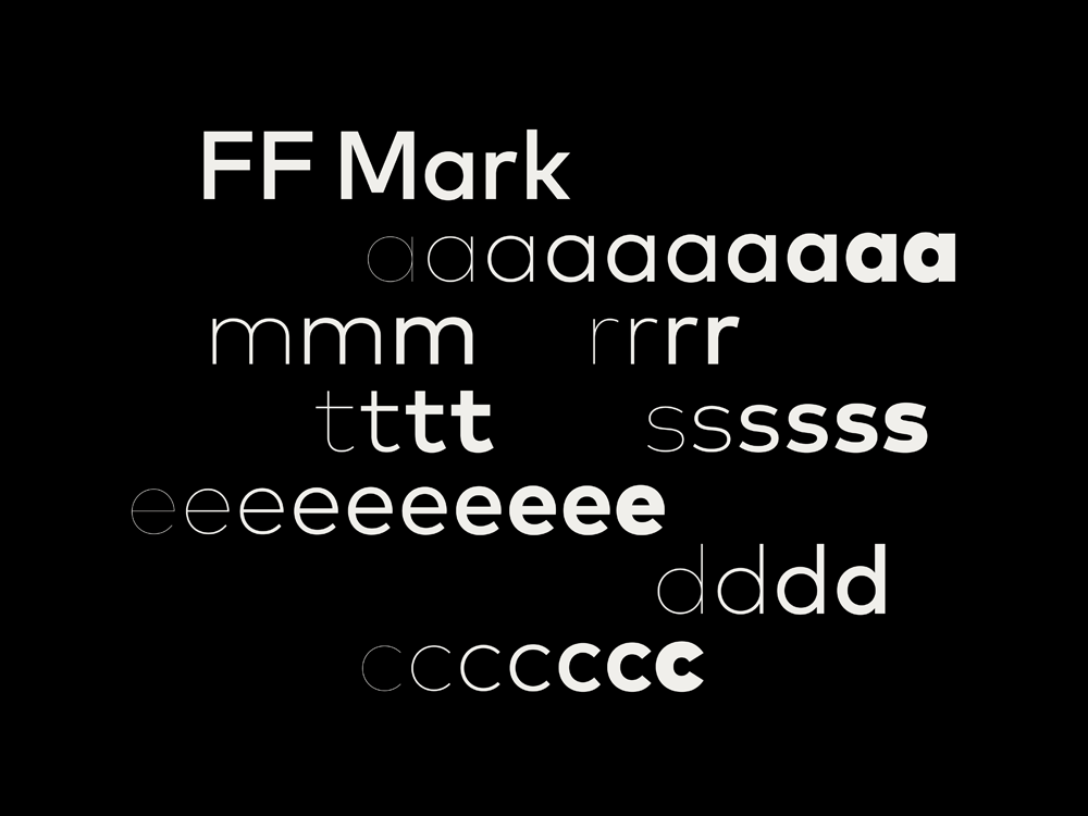
The wordmark approach is the least surprising thing you'll see today and we've officially crossed the saturation point of geometric sans logos into an era where anything else is just plain weird. Here, the wide FF Mark obviously echoes the circles of the icon so it's easy to see how they ended up with this solution. The all lowercase approach is also par for the course for how corporate logos have been behaving. While I think it should be an uppercase "M" for formality purposes I can see how that would break the circular rhythm that the wordmark has going on, instead of introducing a pointy character.
At first, the logo looks almost like a toy version of the original. There is something so un-corporate about it that it's unsettling. I understand that Mastercard is a consumer brand more than a corporate one but it's still the conduit for money, lots of money, and it shouldn't feel like a tech start-up. Or maybe it should. And that's what this logo does in a way, it shakes off that financial institution drabness while at the same time building as minimally as possible on the equity it has built over nearly 50 years of two overlapping circles. As you scroll through the applications below you can see that in its basic-ness the new logo does exactly what it needs to do which is to signal as quickly as possible, "Mastercard!".
One last bonus of the new logo is that it forces the "MasterCard Worldwide" logo into retirement. That thing was really bad. (We reviewed or, more like mentioned it, it in the pre-Brand New era of logo blogging.)
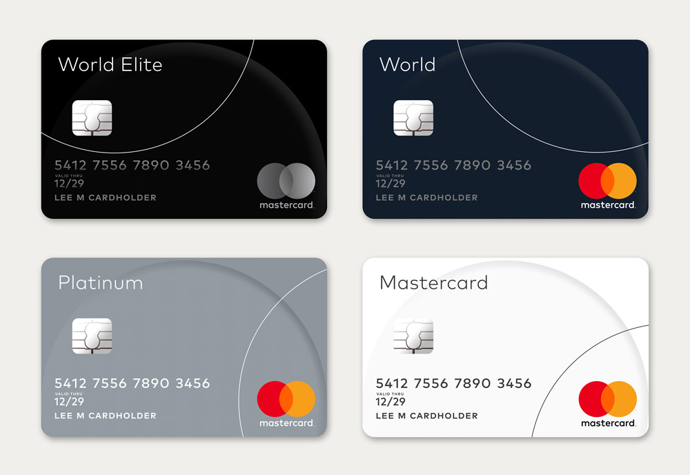

These two images are the best example of that last statement: the logo is easily identifiable and stands out from whatever is around it. One of the biggest benefits of taking the name out of the circles is that the two bright circles now epically eclipse the VISA logo and for the the 17 people worldwide that use Discover, well, it's not a big deal that there is a new orange in the mix.

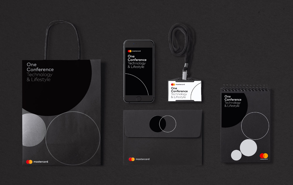
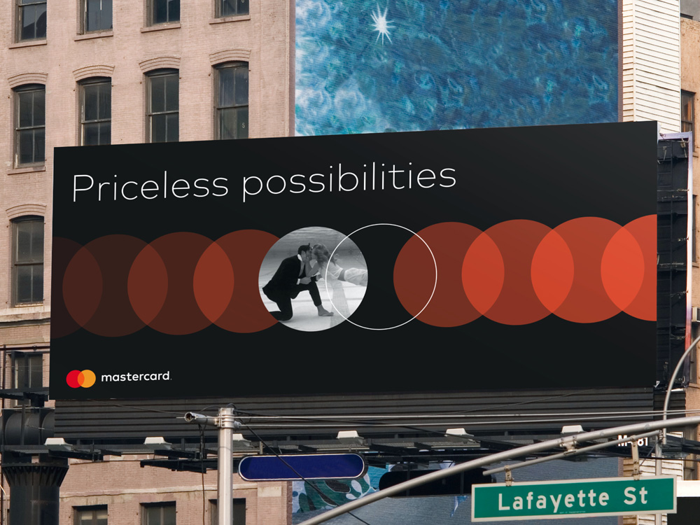
In application, the circle becomes a key and repeating element -- maybe too repeating at times -- with a stroked circle serving to highlight and frame images or simply to break the repetition of full-color circles. The brochure covers look particularly good, with the logo nicely sitting at the bottom and a soothing bone-color background. The event material images shows that the logo and identity can be glammed up. The billboard... I hate. That one shows the least engaging variation possible of the identity, looking dated and diluting the strength the two main overlapping circles.
The geometric-based applications would benefit from hiring a design firm specifically to tackle this -- someone like Moniker or Manual -- who can take that language and explode it beautifully. At this stage, the applications shown are prototypes instead of fully developed products so it would be great for these to be taken one step (or various steps) further to establish a more robust and rich execution.


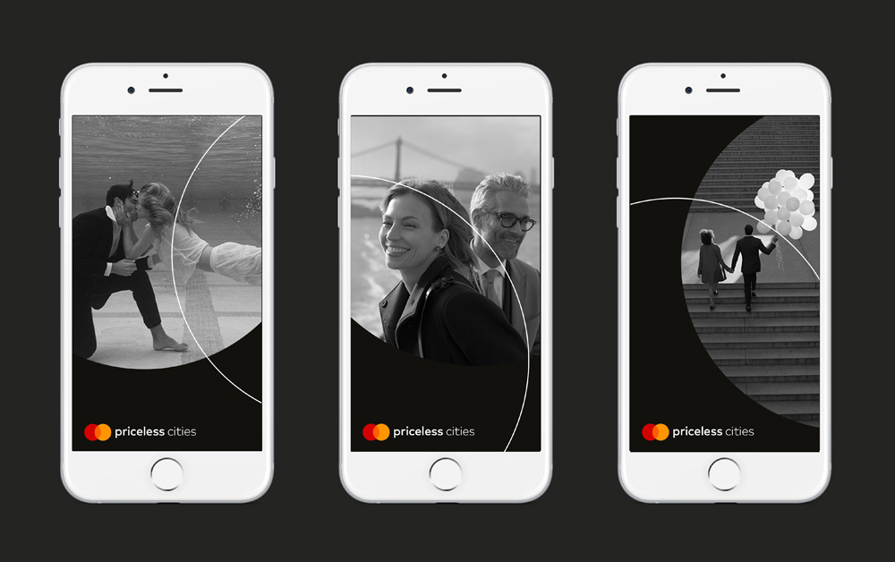
The digital applications are simple and crisp, nothing to get too excited about other than how nice the horizontal lock-up version sits on the header.
Overall, the system is a great clean break for Mastercard to establish a clear house style that stems from the simplicity and crispness of the new logo. To close on that: I can't imagine a new Mastercard logo being anything other than what this ended up being. There is no way (or reason) to get away from the two circles, revealing the orange as a solid color leads to better digital impression, and the typography is the equivalent of 1960s Helvetica where it's the standard-issue approach that's safe and that nowadays, all these geometric sans serifs, immediately communicate a business-friendly attitude. It's not a groundbreaking logo, it's not inspirational, and it's not even cool but it gets the job done, and done right. It's the applications around the logo that will need to raise their game beyond this initial stage that show potential but don't yet reach a "Yeah, that's awesome!" level that I think they should.


Listen up, Pokmon Go fans (which pretty much means all of you.) Are you exhausted from physically searching for 151 virtual creatures for hours on end, but you won't stop until you catch them all? Huge has a solution at its caf in Atlanta.
Huge Caf is located between two Pokstops areas where players can retrieve new items so the agency has been placing "Lures" on them all day, which helps increase the number and quality of Pokmon to catch in front of the shop, said Derek Fridman, group creative director at Huge in Atlanta.
The Lure Module can be used every 30 minutes, and the Lures can be purchased or earned in the game. Mr. Fridman said Huge bought $49 worth of Lure credits so far, and the shop plans on re-upping throughout the week to ensure no shortage of Pokmon.

Las fotos ganadoras del National Geographic Traveler 2016 han sido oficialmente anunciadas. Un premio que busca capturar la increíble diversidad de las culturas, lugares y personas de nuestro planeta, reconoce la fotografía de aquella persona que viaja y es capaz de capturar algún momento vibrante en los dos años pasados. Se pueden encontrar entradas en una de las tres siguientes categorías: naturaleza, personas y ciudades.
De esas tres categorías se distinguen al primer, segundo y tercer premio. Este año, el título más distinguido ha sido para Anthony Lau de Hong Kong con su fascinante fotografía titulada “Winter Hoseman”, tomada en el interior de Mongolia durante un paseo por la mañana. Seleccionada entre miles de fotografías de gran belleza, la imagen de Lau es capaz de expresar ese momento eléctrico que transcurre cuando un jinete mongol y sus caballos toman el galope en la carrera.
El primer premio para la naturaleza es una fotografía que capta a una pareja de zorros iniciando su travesura a través de un paisaje helado. El otro primer premio para las ciudades es en Ben Youssef, un espacio a las afueras de Marrakesh en el que el silencio y los tiempos relajados toman un gran protagonismo.


Los segundos premios se refieren a ese especial instante en el que la naturaleza puede ser muy agresiva, pero en el que son momentos extraordinarios. En el relacionado a las personas, cuando el sol estaba levantando en la mañana, el fotógrafo tuvo ocasión de capturar ese momento en el tejado en el que toda una familia estaba durmiendo. Para el segundo premio de las ciudades, una foto tomada en GuangZhou, China.


El tercer premio para la naturaleza se lo lleva el Desierto de Atacama, en de personas para una tribu de mujeres mayores en una villa remota en Himachal Pradesh, y se termina con las ciudades, con el impacto de un rayo en la torre de Komtar, el lugar más icónico de George Town, capital del estado de Pengan en Malasia.


Tenéis las fotos en su resolución en este enlace.
El artículo Estas son las fotografías ganadoras del National Geographic Traveler ha sido originalmente publicado en Creativos Online.


_Room_HABS_NY,31-NEYO,121-21.jpg)