Uma boa parte deste Natal já aconteceu. Foi no sábado de manhã, em Lisboa, em pleno Tejo, junto ao cais das colunas. De repente, há uma vida humana em perigo. Bem perto, muitas pessoas continuam o seu passeio, filmam com os seus telemóveis. O corpo de um homem inerte boia nas águas sujas do rio. A face voltada para baixo, como o pequeno Alan Kurdi, a criança síria de apenas 3 anos de idade, que morreu da mesma forma ao largo da ilha de Lesbos, Grécia, e que o artista chinês Ai Wei Wei imortalizou na sua célebre fotografia em 2016.
“Voltaria a fazer o mesmo. Uma vida humana não tem preço”, explicou humildemente José Luís Brito. Ele foi o homem que, como outros, vendo o sucedido não hesitou. Despiu a roupa que entregou ao seu filho de apenas 7 anos e saltou sozinho para salvar quem não conhecia.
Apenas um corpo sem rosto, boiando. Um desconhecido, como tantos com quem nos cruzamos diariamente. Um homem que minutos antes tentara o suicídio: de verdade, a procura da morte contém sempre um apelo escondido, um segredo dito em voz muda que apenas deseja uma coisa. A vida. Eu sinto que tenho de morrer para poder continuar a viver. Sem este sofrimento. Sem esta dor. Esta era a mensagem que recordava um dos meus mestres, Moses Laufer, director do Brent Adolescent Centre, em Londres.
A capacidade empática e a capacidade de dádiva são características recentes da evolução da espécie humana. Têm cerca de 25 a 30 mil anos os primeiros túmulos que mostram que alguém foi cuidado por outrem até à hora da sua morte. E mesmo doente ou incapaz, foi investido pelos outros que dele quiseram cuidar, celebrando a vida através do ritual da morte.
O menino do Lapedo corresponde a uma descoberta arqueológica feita em Portugal no ano de 1998. Pela primeira vez era encontrada a sepultura de uma criança envolta numa mortalha de tom vermelho, junto da qual existia um ramo de pinheiro queimado: cuidar, envolver, dar aroma. Celebrar a presença do outro no momento da sua dolorosa partida.
Ninguém pediu nada a José Luís. As imagens que documentam o seu acto heróico foram obra do acaso. Não agiu esperando recompensa ou celebração. Saltou para o desconhecido, com certeza arriscando a sua própria vida diante do filho, por um mero impulso de consciência. Por breves minutos relembrou-nos o que tanto esquecemos e não praticamos ao longos dos dias, dos anos, em tantos natais, afinal, como outros: cuidar de alguém. Estar perto dos que mais precisam. Ajudar os que sofrem e, silenciosamente, ainda vivem (?) em silêncio na sua imensa dor. Os que já não têm rosto e simplesmente flutuam ao sabor da corrente, tristes, esquecidos, perdidos.
Hello everyone. Originally, this post was supposed to be devoted to the year 1978, however something came up, and by something, I mean this 2.2 million-dollar, 5,420 sq ft 4 bed/4.5 bath house in Colt’s Neck, NJ.
You see, usually, when a listing goes viral, I’m content to simply retweet it with a pithy comment, but this house genuinely shook something in me, genuinely made me say “what the (expletive)” out loud. It is only fair to inflict this same suffering onto all of you, hence, without further ado:
Looks normal, right? Looks like the same low-brow New Jersey McMansion we’re all expecting, right? Oh, oh dear, you couldn’t be more wrong.
Guess who’s making a list and checking it twice?
Guess who’s gonna find out who’s naughty or nice?
Guess who’s coming to town?
Guess who’s coming to town to drag your ass into hell?
A gentle reminder that it is not yet Thanksgiving.
But oh. Oh. It continues:
If you’re wondering what’s happening here, you’re not alone, and sadly there is no convenient way to find out via a kind of haunted house hotline or something.
I can’t even label these rooms because frankly I’m not even sure what they are. All I am sure of is that I want out of them as soon as humanly possible.
How is it that a room can simultaneously threaten, frighten, and haunt me? Me, of all people!
My eyes do not know where to go here. They go to the window, they go to the fireplace, they go to the massive mound of fake plant and statuary currently gorging on the leftmost corner of the room, they go to my hands, which are shaking.
“Hello, I would like to get in touch with the Ministry of Vibes? Yes, I’ll hold.”
I haven’t been this afraid of a shower since I went to Girl Scout camp in the fifth grade and there was a brown recluse spider in the camp shower and I screamed until the counselor came in and told me it was only a wolf spider but it turns out those still bite you and it hurts.
I love watching Still Images on my Television Set :)
Nobody make a sound. He’s watching you.
i spy with my evil eye:
:)
Their souls are trapped in these photographs forever :)
Okay, phew, we made it out alive. Here’s the back of the house I guess.
Well, I hope you’re as thoroughly disturbed as I am. Seriously, I’m going to have trouble sleeping. I mean, I already have trouble sleeping, but this is just making that existing problem so much worse.
There is a whole new slate of Patreon rewards, including: good house of the month, an exclusive Discord server, weekly drawings, monthly livestreams, a reading group, free merch at certain tiers and more!
Not into recurring donations but still want to show support? Consider the tip jar! (Tips are much appreciated since I am making a cross country move in two weeks!!!)
Or, Check out the McMansion Hell Store! Proceeds from the store help protect great buildings from the wrecking ball.
Há três dias, 15 países da Ásia e da Oceânia firmaram o maior acordo comercial do mundo. As negociações remontam a 2012 e o acordo irá abranger, read my lips, 2.100 milhões de consumidores. O equivalente a, read my lips, 30% do PIB mundial.
OS EUA estão de fora, em mais um desastre de Trump, mas esta associação compreende: a China, a Índia, o Japão, a Austrália, a Nova Zelândia, a Indonésia, a Tailândia, Singapura, a Malásia, as Filipinas, o Vietname, o Camboja, Laos, o Brunei…
Vão ser eliminadas as barreiras alfandegárias em 90% dos produtos comerciados nessa zona gigantesca.
Perante isto, o que diz a União Europeia?
Que dizem os EUA a esta alternativa ao defunto TPP, de Barack Obama?
O facto foi noticiado muito en passant nos nossos jornais – Público, Diário de Notícias, Observador, etc.
Sobre isto, que dizem os comentadores nacionais? Que pensamento têm produzido, que ideias nos têm trazido?
Abrem-se os jornais, há muito artigo e muita opinião sobre os «liberais» e os defensores do Chega, pouca ou nenhuma coisa sobre como será o mundo nascido dos escombros da Covid e como poderão a Europa, os EUA e o Ocidente lidar com a hegemonia da China, que a pandemia, Donald Trump e tudo o mais vieram adensar brutalmente. Notícia de há um mês, na Time:
I have a low-grade obsession with the project of teaching computers how to joke. I assume it has something to do with my poetry education, which gave me both a greater appreciation of humor (and the many ways in which it can be mangled and misunderstood), and the tenuous divide between art and nonsense.
Wherever my fixation germinated, its current manifestation is me googling “teaching computers to joke” every so often, just to see whether scientists have made any great strides since I last checked. Recently, my searching led me to The Joking Computer out of the University of Aberdeen. The site explains a little about the reasons behind the group’s research—both to help children with disabilities that make speaking difficult explore language, and as a purely scientific analysis of “the secret of humor.”
The true joy of the website, of course, is the computer jokes themselves. Not only will the program give you a computer generated joke (you can choose from a number of different types, including “two similar sounding words are used one after the other” and the classic “swaps a word for one that rhymes with it”), it will also explain the joke to you (“Why is it a joke?”). You can rate them, too, which helps the researchers.
Personally though, I find it difficult to rate them because they are perfect, each and every one:
What do you call a cross between a weakness and a touch? Failing feeling.
What do you get when you cross a construction worker with a warmth? A hard heat.
What is the difference between a principal truck and an egotistical male person? One is a main van, the other is a vain man.
What do you call a just disparity? A fair cry.
If you’re looking for a few moments of respite from rational thought, I strongly recommend checking them out for yourself.
René Magritte, Les amants, óleo sobre tela, 54 cm x 73 cm, 1928
1 – Que esta Coisa da Covid-19 não passa de um episódio, mais um, da crise ambiental que há muito se desenvolvia sob a forma de Desastre Climático Iminente. Portanto, é provável que episódios como este da Coisa da Covid-19 se venham a repetir, sob a forma de doença ou outra.
2 – Ou seja, a juntar à Coisa da Covid-19 e às suas sequelas e mazelas (políticas, económicas, sociais), iremos ter de enfrentar, no tempo que em nossas vidas nos resta, com Coisas iguazinhas e provavelmente bastante mais piorzinhas do que esta Coisa da Covid-19.
3 – Que esta Coisa da Covid-19 poderá ter suspendido e até retardado um bocadito o Desastre Climático Iminente, mas que, se não houver tino e juízo mundiais, o retorno à «normalidade» e o afã de «reconstruir» sem olhar a meios ainda irão ser mais graves para o acelerar do Desastre Climático Iminente.
4 – É muito pouco provável que haja tino e juízo mundiais.
5 – Ou seja, é muito provável que o Desastre Climático Iminente se vá tornar ainda mais iminente e ainda mais desastroso.
6 – Esta Coisa da Covid-19, dizem alguns (Bruno Latour & compinchas), serviu de «ensaio geral» para o Desastre Climático Iminente mas, digo eu, não serviu de «ensaio geral» para Coisa nenhuma e se serviu foi para mostrar o quão pouco estamos – e continuaremos a estar – preparados, organizados e sobretudo unidos para enfrentar a Coisa do Desastre Climático Iminente.
7 – Ou seja, vai ser no mínimo chato.
8 – Que o desconfinamento é uma operação mil vezes mais complexa do que o confinamento, pois o confinamento é uma Coisa simples, é pôr as pessoas em casa e em casa ficam em segurança, tout court e sem mais, enquanto o desconfinamento é uma Coisa que implica tirar as pessoas de casa, sim senhor, mas não é tirar por tirar, é tirar as pessoas de casa com segurança. E, já agora, fazê-las viver um tempo novo sem as coordenadas do antigo.
9 – Ou seja, se achamos que esta Coisa da Covid-19 é complicada, a Coisa depois da Coisa da Covid-19 vai ser ainda e muito mais complicada.
10 – E a culpa não é desta Coisa da Covid-19, coitadinha, que faz aquilo para que existe e foi criada, a culpa é dos seres humanos que já antes desta Coisa da Covid-19 chegaram à beirinha beirinha do Desastre Climático Iminente e para chegar ao Desastre Climático Iminente não foi preciso a Coisa da Covid-19, bastou a Coisa do Ser Humano.
11 – Ou seja, como nós não podemos nem queremos e nem jamais devemos acabar com os seres humanos – novos e velhos, com todosos seres humanos, porque todos são humanos e porque todos são seres –, como nós não podemos acabar com os seres humanos, dizia, e como o problema fulcral está na Coisa do Ser Humano, vamos ter muita Coisa à nossa frente, como atrás se disse.
12 – E tudo isto são Coisas chatas de pensar, mas Coisas em que devemos ter a chatice de pensar (e não é por não pensarmos nelas que elas vão deixar de acontecer.)
Há muitos anos atrás, quando existiam coisas como agências de publicidade, editoras discográficas e agências de viagens, eu tinha algumas pessoas amigas a trabalhar em publicidade. Copys, designers, criativ*s, accounts, todas contavam o mesmo cenário: ambiente tóxico, cheio de egos, ostentação, e mais orçamento que bom senso. E, marco incontornável: um diretor insuportável (na grande maioria um homem, com algumas mulheres monstruosas de assinalar), de pesadelo, tirano de humor instável e uma carreira pejada de prémios (eram todos históricos criadores de anúncios que tinham passado a fazer parte do imaginário nacional, tinham todos trabalhado com o Ary dos Santos e com o Alexandre O’Neill, eram todos o melhor copy desde que o Pessoa disse aquela cena da Coca-Cola ). Quando saiu O Diabo Veste Prada, todas estas pessoas amigas se arrepiavam com a Miranda Priestley (e, passe a representação estelar da Meryl Streep, não lhe achavam gracinha nenhuma): é mesmo assim, diziam, com a voz rouca de stresse pós-traumático. Do cantinho da pequena empresa familiar em que eu trabalhava, dava graças aos céus e perguntava-me como era possível ainda existirem chefes assim.
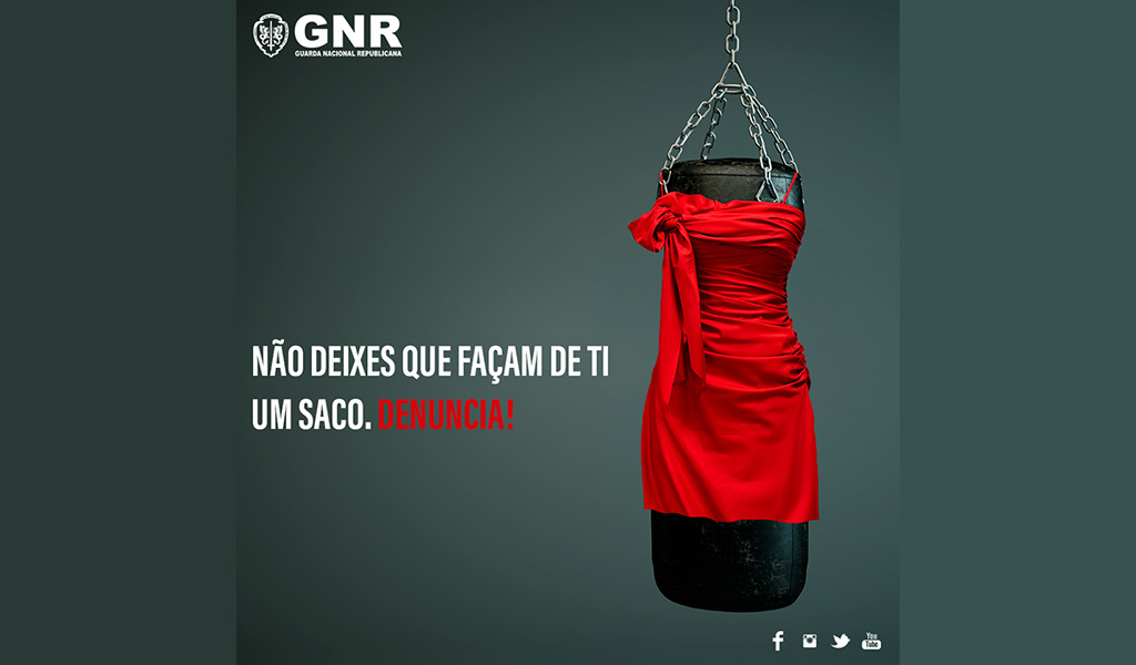
Quando vi este anúncio da GNR, percebi (não pela primeira vez) a utilidade d* chefe de pesadelo. É evidente que há na GNR, ou na agência com quem trabalham, um pequeno génio de publicidade; alguém com um imenso potencial criativo, um talento ímpar para juntar ideias, e o dom de as pôr por palavras. Mas. Com um potencial a precisar de muita orientação. Alguém que trave a criatividade desenfreada e a frase que só soa bem aos nossos ouvidos. A violência emocional nunca é desculpável, e não sou de todo defensora de estruturas hierárquicas, mas assim que vi este anúncio pensei que o que fazia falta, neste caso, era um WTF ribombante de um* dess*s chefes de pesadelo.
Quem é que deixou passar isto?
Quem é que deixou que a admirável iniciativa de uma campanha para encorajar as vítimas de violência doméstica a pedir ajuda se transformasse numa campanha de culpabilização da vítima?
A quem é que ocorreu que o motor da violência doméstica é uma suposta permissividade da vítima?
Quem é que ainda acha que a violência doméstica acontece porque a mulher “deixa”?
O que uma mulher em situação de violência doméstica mais quer é precisamente deixar. Deixar a situação, deixar aquele homem que a violenta, deixar de se sentir, sim, um saco de pancada. E em tantos casos, é precisamente isso que ela não pode fazer: não pode deixar a casa por não ter para onde ir em segurança. Não pode deixar a relação por medo de represálias. Falta apoio institucional que a proteja devidamente.
E é dolorosamente irónico que seja precisamente uma das instituições responsáveis pelo combate à violência doméstica a revelar uma tão grande falta de compreensão da mesma.
“Não deixes que façam de ti saco de pancada”? Não deixemos que façam de ti culpada pelo crime de que és vítima.
(Por falar no dom das palavras, hesito sempre, quando escrevo sobre violência de género, antes de usar a palavra “vítima”. Precisamente porque, para quem se encontra nessas situações, uma das coisas dolorosas e traumáticas é ver toda a sua identidade reduzida à de vítima. Copys que por ainda aí andem, ajudem!)
(E já agora quem, à exceção do Bugs Bunny quando se veste de senhora para fugir ao Elmer Fudd, é que acha que um vestido vermelho justo é o sinal universal da figura feminina?)
PS – Sobre a Miranda Priestley e o arquétipo da mulher num cargo de poder ser sempre uma cabra, outro post mais longo seguirá em breve.
But it is December, the official month of Best-of Listicles, and therefore I am contractually obligated to ask: which book covers were the best? To answer the question, as I did last year and the year before that, and good lord, the year before that, I cut to the chase and consulted the experts: the book designers themselves.
Article continues after advertisement
This year, I asked 26 of my favorite designers to share their own favorite book covers of the year, and they came back with a whopping 78 different selections. But of course, some of them had similar ideas about the best of the best. Here are the final stats, if you’re into that kind of thing. Below that, you can feast your eyes on all the covers they picked, in order of publication date.
The very best book covers:
Yoko Ogawa, The Memory Police, design by Tyler Comrie : 9 votes
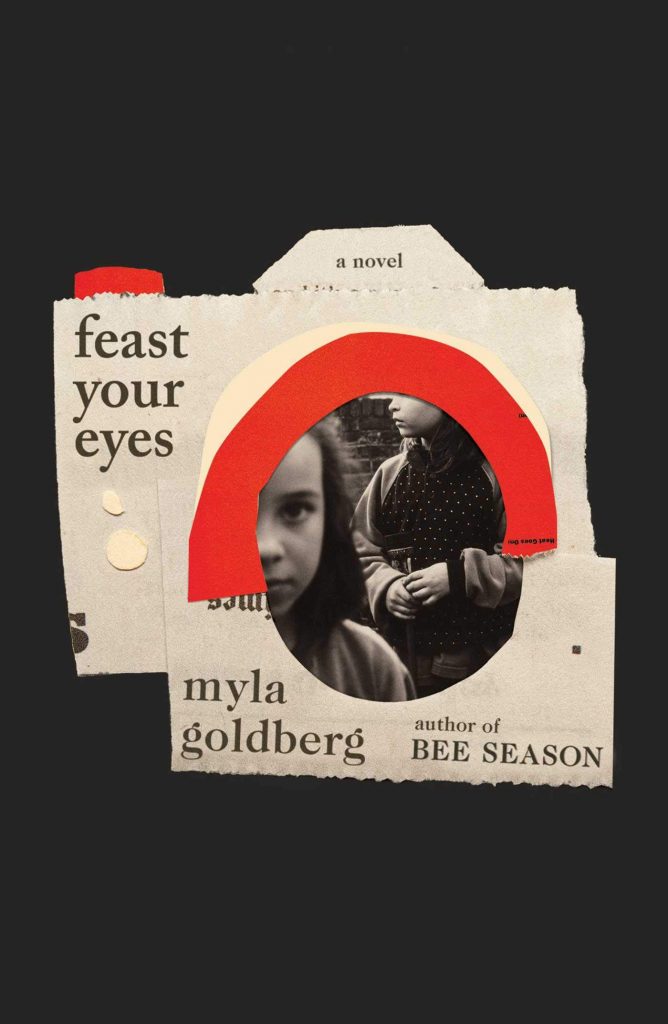
Myla Goldberg, Feast Your Eyes, design by Lauren Peters-Collaer : 6 votes
Tegan & Sara, High School, design by Na Kim : 5 votes
Regina Porter, The Travelers, design by Michael Morris : 4 votes
Dunya Mikhail, In Her Feminine Sign, design by Janet Hansen : 4 votes
Jac Jemc, False Binggo, design by June Park : 4 votes
The press with the most covers on the list:
FSG (including MCD x FSG originals) : 18 covers
The designer with the most covers on the list:
Na Kim : 7 covers
*
Cover design by Alex Merto (FSG, January 8)
Such a clever image, both delicate and sinister. Also love the modern feel this has with the use of neon inks on natural papers.
Cover design by Oliver Munday (The New Press, January 8)
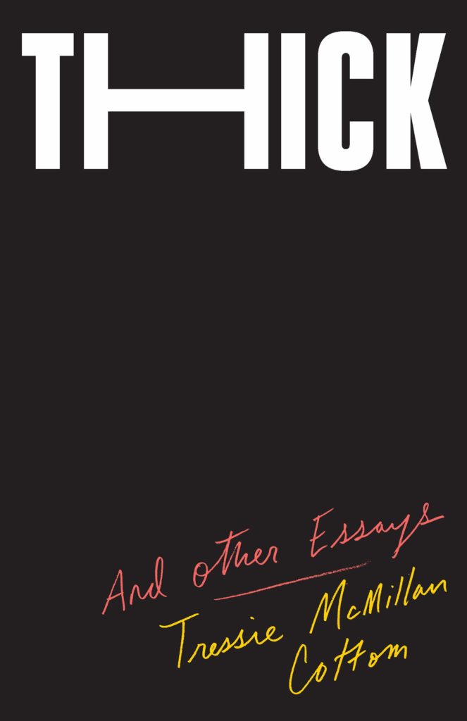
When so many designs have their main visuals in the center, it’s very satisfying to see a layout that leaves the middle completely blank. The handwritten subtitle and author are an ingenious contrast to the weighty title—I find it so exciting when type is used in such a creative way that additional imagery isn’t needed.
The description and blurbs for this book detail characters who are searching without knowing what they seek, quiet suspense and spare and exacting prose. Grace’s art selection could not feel more perfect. Lino Lago’s “fake abstract” painting and the clean minimal typography give a modern sensibility, a historic nod and the sense of something being uncovered.
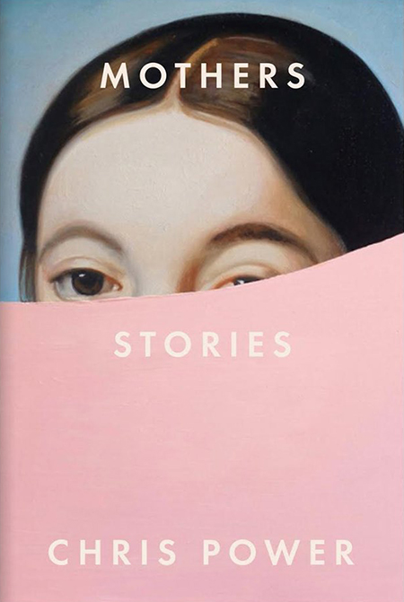
I was immediately drawn to this cover when I first saw it in the bookstores. The cutoff at the bottom half of painting is at the right placement exposing a sliver of the right eye where the slight tension is enough to bring intrigue to the viewer. The light pink is a lovely contrast to the oil painting and brings the image into focus.
Cover design by Michael Morris (Crown, January 29)
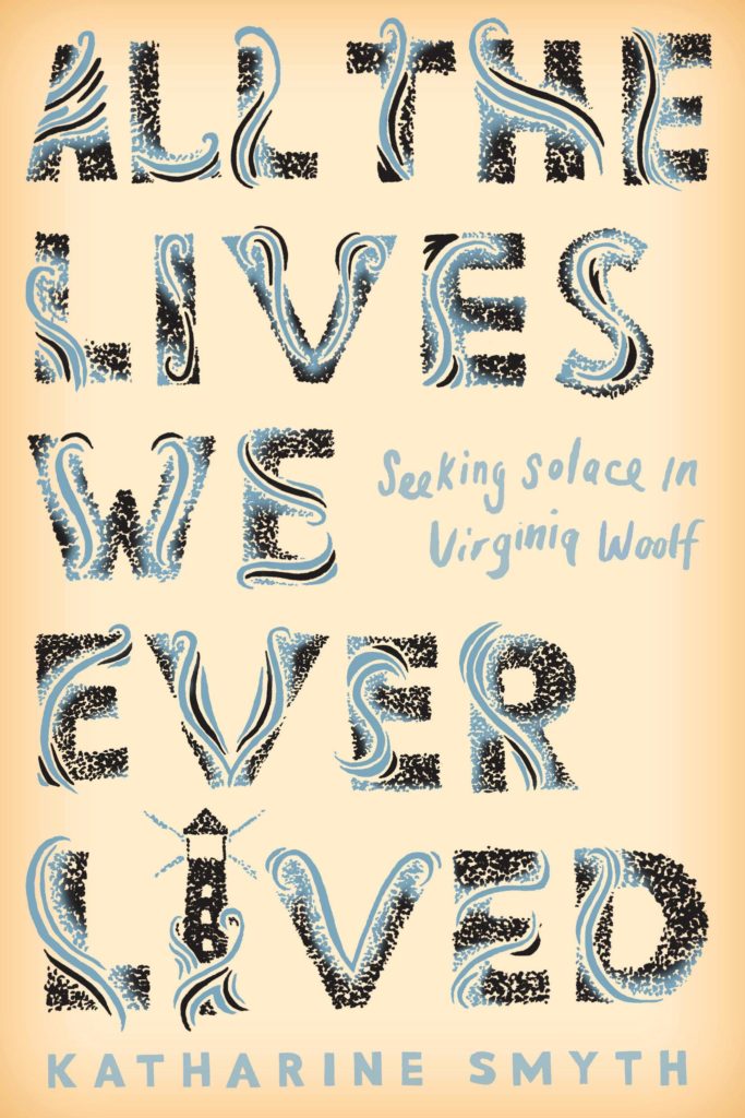
A lovely pastiche of the classic Hogarth Press Editions for Virginia Woolf designed by Vanessa Bell. The wonderful culmination of tiny details and care.
Cover design by Rodrigo Corral (One World, January 29)
My eyes feel like they’re playing tricks on me with this cover. The pattern on pattern design, and white type on off-white background is totally mesmerizing.
I’ve seen stretched type, but I don’t think I’ve seen a cover with stretched imagery executed to such visceral effect. The drooping, face-down profile conveys a feeling of malaise in such a refreshing way. I’ve never been as excited about misery.
Cover design by Grace Han (Riverhead, February 19)
My eyes do not seem to want to focus on one element. Everything is rushing at me. The energy of this cover is so good. I can’t help but be curious about the energy of the writing inside.
I love how there are three distinct elements here, but they are all integrated seamlessly. The drops look like they could also be feathers of the bird. And the type is layered into the drops. And on top of it all . . . it’s green!
Cover design by Richard Green (Tim Duggan Books, February 19)
This is a jacket design that’s just as effective as Big Bang, but its polar opposite. The lack of volume and energy gets the point across here. Is there anything sadder than this title paired with a bee in the fetal position? (I can’t bring myself to say it’s dead.)
Cover design by Oliver Munday (Doubleday, February 26)
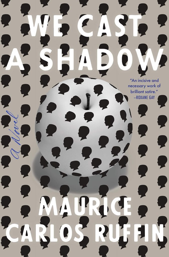
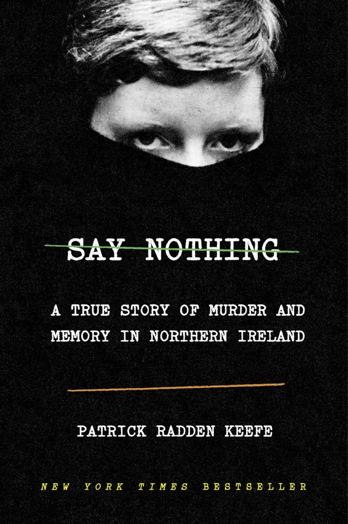
This cover encapsulates all the information the reader needs with so few elements. The green and orange lines nod to the Irish Flag and represent the Catholic and Protestants. The real focus of the cover, however, is Dolorous Price who stares at you over the edge of her turtle neck, the classic uniform of the IRA.
I enjoy the wit and playfulness of this design. It’s a clever way of combining two unlikely things together, and in this instance, it just makes sense.
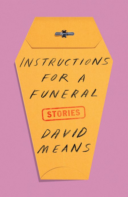
Alex’s casket-shaped bureaucratic envelope immediately telegraphs the book’s subject matter. So I love this cover for how succinct it is . . . but also that he’s managed to imbue a sad topic with humor.
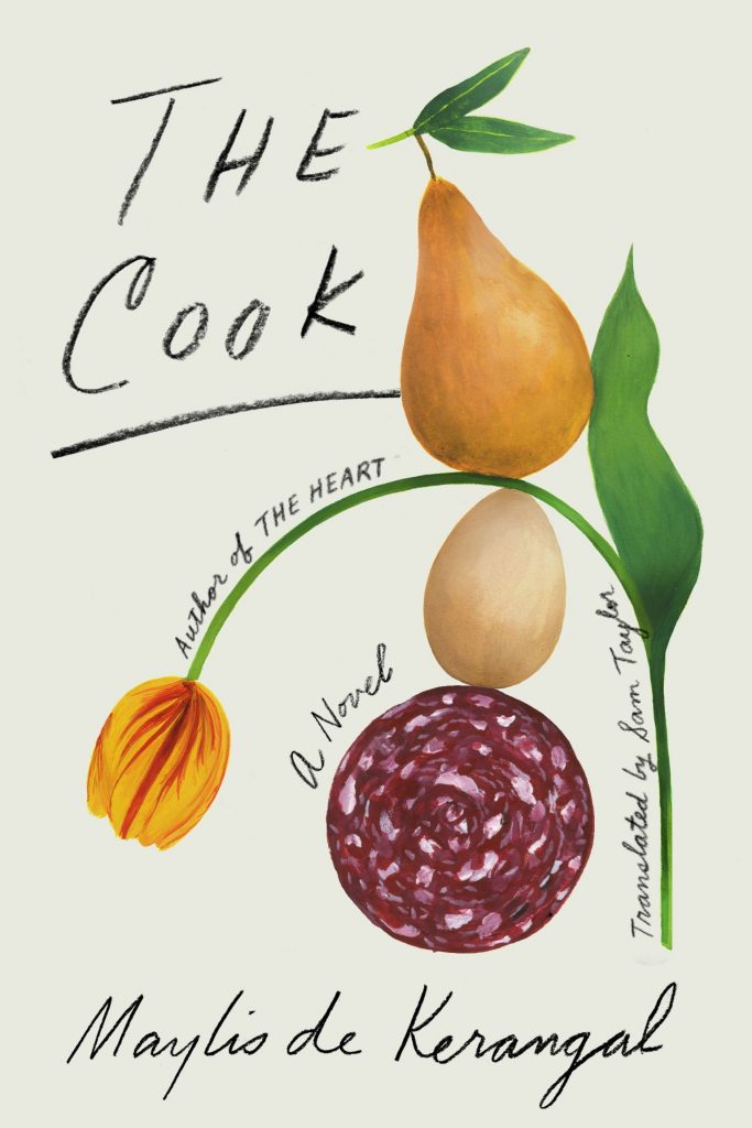
I love this book cover because it’s such an unexpected—but exquisite—pairing of art and lettering. At first glance you think you’re looking at a staid and elegant old botanical print, but then you realize that Na has snuck in meats and fruits where they have no business being. And the tragically drooping tulip makes me laugh.
Not only do I feel hungry when I see this cover, but I’m intrigued by the ever-so-graceful balance of shapes and form and the type which complements them.
This is one of those delightful covers so easily likable by the general population I hesitate to confess how much I like it, too—but I can’t deny how excellent it is, nor can I peel my eyes from it. Between the illustrations and the hand lettering, there’s so much to feast on. It’s tender but not saccharine. Pretty sure Na did the illustrations as well, which makes it all the more satisfying.
Cover design by Donna Cheng, cover illustration by Gerrel Saunders (Gallery/Scout Press, March 19)
Queenie herself is that star of this cover, which is fitting since she is also the star of this book. The title tucked into her hair like a crown and the “A Novel” tucked in above her ear are just perfect.
Covers designed by Rodrigo Corral (Picador, April 2)
Beautiful in hand with uncoated stock, debossing and gloss and just as powerful on screen. They are art objects for your shelf but also entice me to read them back to back in succession to learn the inspiration behind the image selection. I swear I would wash my hands well or read these with gloves on so as not to wreck their beauty!
The art on Tyler’s cover is beautiful, but also deceptively simple—it’s actually quite rich with subtle detail. And overall, the colors and lettering strike a perfect balance.
I love that clean and bold illustration. There are some multidimensional messages happening in that emblem and it’s got me so curious about the book….That blue background is lovely and the delicate gold foil fragments on uncoated stock makes the cover that much more special.
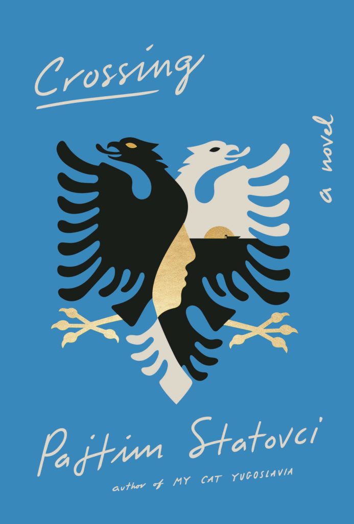
Cover design by Helen Crawford-White (Head of Zeus, April 4)
I adore this cover! It feels so familiar and fresh at the same time—channeling the likes of Paul Rand, Alexander Calder, Henri Matisse, but with a something all it’s own. It is whimsical in its use of color, as well as its abstract and anthropomorphic forms. The nuance of texture and shaded elements draw me in, telling me that there is something more, something dark and strange inside these pages that I need to know. Quirky and surreal, I find it terribly charming.
Cover design by Lauren Peters-Collaer (Scribner, April 16)
Such a clever use of a collage! The pieced-together camera works as a compelling device to hold the inset photo and type. The limited palette and organic illustration are perfection.
The confidence of this cover crushes me. It demands just the right amount of work from the viewer, a tough line to walk when playing with unique copy/type treatments. The unusual cropping of a young girl gazing directly at you, eerily out of focus, carries the darkness set by the surrounding black and vast negative space. The irregular edges and distressed paper in the collage, as well as the type, are rendered perfectly. This cover really stood out on tables and shelves in store, a total knock out for me.
All the elements feel considered. I love how the red frame brings focus to a photo with depth. It makes me feel like I’m actually looking through a camera lens.
Cover design by Elena Giavaldi, illustration by Molly Bounds (Hogarth, April 16)
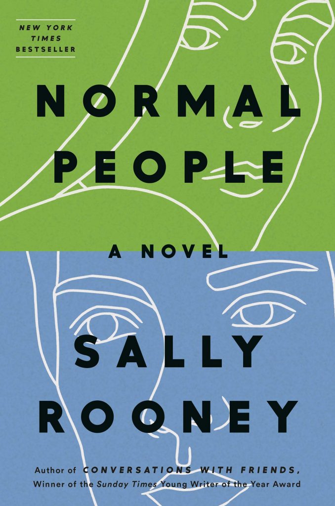
Sally Rooney’s first book had such a distinctive look that it would be a challenge to create the cover for her second that doesn’t feel like it’s in the shadow of Conversation with Friends, but this cover succeeds. The characters in the white line drawings are not even looking at each other and yet you can feel the tension between them. The thick, black type contrasts with the delicate illustrations while the color blocking signals that the characters are trapped in very different worlds.
Cover design by Jonathan Bush (W. W. Norton, April 16)
The giant type makes this cover look so big, yet elegant and substantial . . . and important! Without any other type on the cover, this design is minimalist and maximalist at the same time.
The simplicity of the type and bold focal image work together so perfectly. The image is presented in a way that reinforces the subject of the book all while creating a sense of intrigue. And despite the fact that the subtitle is obscured, we are given enough information to read it.
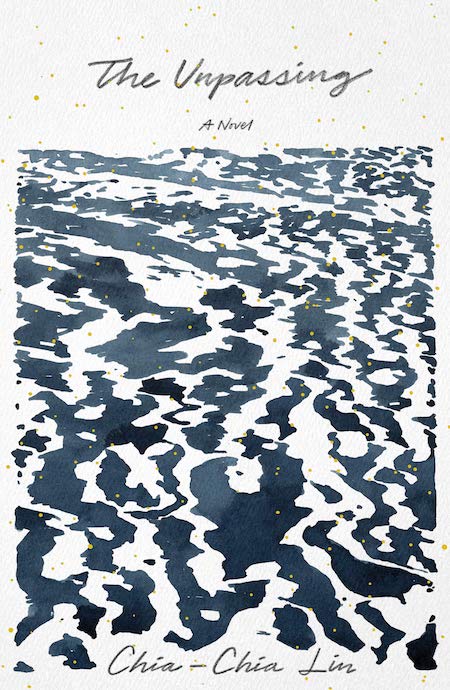
There is so much sophistication in the way the sea is rendered, incorporating as much negative space as positive. Set in Alaska, the water is appropriately icy and harsh, yet full of movement—redolent of a Rorschach test. Simply bleak and beautiful.
Every time I look at this cover it evokes a calm zen feel. The watercolor painting fills most of the cover and although it’s quiet, the small flecks of gold over the art give it that extra distinctiveness.
It’s always a pain when editors give us extraneous copy to put on a cover. However, the way the tagline (or rather tag-paragraph!) is incorporated into the design, here, looks effortless! Also, I love the quirkiness of that “Q”!
Cover design by Matt Dorfman (W. W. Norton, May 28)
I love Matt Dorfman’s work. This book cover in particular is delightfully disorienting. The quirky juxtaposition of word and image, varied textures, type orientation, all come together to create a timeless art work. I particularly love the exaggerated elevation of title elements creating depth and space, deepening the dissonance between language and image. It is concise, clear, and I think quite brilliant… and it makes me smile.
So simple and elegant, burned in my mind when I saw it. A bold and memorable typographic approach with great use of effects, helping to create a coveted physical object.
Covers designed by Jim Tierney (Ace Books, June 4)
Jim is so incredibly talented and I also want to commend art director Adam Auerback who I believe selected Jim for the project. We do not hear as much about ADs, but they start this process and choosing the right person is an important skill set. I could not think of a better illustrator and designer to put a modern face on Dune, with each illustration and typographic layout inviting you deeper into the undulating terrain . . . and they feel so great in the hand! You must take home every single one.
Cover design by Michael Morris (June 18, Hogarth/Crown)
These many colors are so pretty and unusual. This cover has a unique energy and curiosity, and my eye doesn’t stop wandering the page for more subtle surprises.
This is a very fun and dynamic cover that has the right amount of design elements converging together. The dispersed bright colors, intersecting angles, spiked bursts, and differing type sizes overall creates this energetic dimension that doesn’t have a still moment.
I love how understated this cover feels in the midst of some bold design choices. Those tiny, disembodied arms floating in space are mysterious, and even though the title and author sit quietly at the top and bottom, the spacing is unusual and intriguing.
Cover design by Oliver Munday (New Directions, June 25)
This cover is so lovely, but when you look closer you wonder hmmm whats going on here. The crow is a signifier that this might be a bit macabre, but the palette is such a contrast that its makes you scratch you head. It’s sorta delicate and small for a cover, but as a teeny online thumbnail the composition is stronger than most. A win-win!
Cover design by Pablo Delcan (New Directions, June 25)
One common criteria for a “good cover” is the ability to draw the reader into the book, and this red soaked man checks that box with a big “” Is he angry? Heartbroken? Pensively dripping with paint? I want the answers to the questions this cover asks!
I have only seen this cover on screen but the spareness, the color and the incredible photograph of the typographic cubes melting immediately piqued my curiosity and sent me to the book description page. A perfect summer read cover! I should hunt this down in a shop just to touch it.
I love how the letters are concrete which makes the cover more alive and expressive. The treatment of the title alone does the job of setting a sense of place and mood. It’s pleasing to the eye and therapeutic just looking at an image of melting letters.
The organic and spirited treatment of this cover works so well with the hand-drawn type and illustrated snake and plants that are bleeding off the edges. It reminds me of a protest poster which is fitting to the title.
I love a fully hand-drawn cover, especially one that looks like it was made by a grade-schooler. The rudimentary quality feels so right for a book of poetry.
No doubt Oliver Munday has had some top notch covers this year, but this one stopped me in my tracks. The square pool of red, itself reminiscent of a stop sign, creates a feeling of unrest and foreboding. This cover held me in feeling for a time, delaying my typical hyperactive jump into ogling and critiquing. The restraint in composition, the rigidity of shape, form, and color, the blood red, and the oh so subtle nod to time period via type and clothing style, this cover is nothing short of iconic to me.
Gravei esta imagem para o disco não sei de onde. É provável que a tenha visto no facebook ou num blogue. Guardei-a porque conheço perfeitamente aquele lugar e aquele tempo.
Estudei naquela escola. É o Ciclo Preparatório de Vila Real. Sei que a fotografia foi tirada na passagem da década de 1970 para a de 80.
Não reconheço nenhuma das pessoas da foto, excepto a menina ruiva que me lembro de ver anos depois no Liceu Camilo Castelo Branco. Andava dois ou três anos à minha frente, portanto aqueles rapazes e raparigas devem ter agora cinquenta anos. A maioria terão filhos, talvez mesmo netos. É possível que alguns tenham entretanto falecido.
Ganhei o hábito de a ter aberta no desktop. Quando o computador vai abaixo, reabro-a. Comove-me de um modo que me surpreende, dado não me ser pessoal. Representa perfeitamente um conjunto de memórias minhas das quais não tenho as minhas próprias fotos.
Passei muito tempo na biblioteca, a parte mais elevada do edifício que se vê atrás. A entrada da escola era um portão assinalado pelos dois mastros mais altos. Chegava-se através de uma avenida recente marcada de cada lado por uma fieira de candeeiros de iluminação pública. Em frente ao ciclo, havia quintas, vinha, mato, pinheiro bravo. Agora, há vivendas, serviços, centros de saúde e pavilhões desportivos. É possível que todo aquele horizonte esteja hoje eriçado de casas.
A memória daquela paisagem é só um detonador para chegar ao que verdadeiramente me comove. Sensações às quais não é difícil aceder individualmente mas que se tornaram inacessíveis no seu conjunto.
Lembro-me daquelas nuvens sempre pesadas que pareciam tão sólidas a um miúdo transplantado do sol de Lisboa. Foi nesse preciso sítio, naquele pátio molhado pela chuva que vi nevar pela primeira vez, numa véspera de Carnaval penso que em 1983. Recordo-me de passar o Inverno com frio, com as botas e meias sempre molhadas como as das crianças da foto.
Quase não há fibras sintéticas, plástico ou nylon naquelas roupas. As cores são escuras, castanhos, ocres, os pretos têm o pardo das fazendas, os brancos, a sujidade natural da lã. Lembro-me do momento, também naquele pátio, em que percebi a ausência daqueles tecidos e cores antigas. Os meus colegas e eu próprio tínhamos trocado as samarras e as canadianas por Kispos de cores eléctricas, berrantes de televisão a cores.
Ainda hoje sinto uma espécie de aperto pela sensação e cheiro da fazenda junto à pele.
Se não tivesse outras maneiras de o fazer, poderia datar a imagem pelas roupas. Não sei quando se começa a ter consciência do tempo histórico, da passagem de uma época para outra. Penso que o que me atrai nesta imagem que não é minha é a lembrança por associação da parte da minha vida em que comecei a perceber o movimento da história, todas as sensações físicas, emocionais, que ficam para trás, soterradas pelo que viria depois, impossíveis de recuperar pelos dispositivos de memória habituais, mesmo os mais sofisticados.
Uma coisa que não percebo ou, se percebo, percebo que é pelas mais vis e venais razões. O El País aceita ter no seu interior um extenso caderno de várias páginas chamado China Watch que é um descarado panfleto de propaganda ao regime de Pequim. Notícias sobre notícias do império maravilhoso, nem uma palavra sobre direitos humanos, minorias étnicas, Prémio Sakharov, protestos nas ruas. É esta a matriz ética do El País? E, já agora, de muitos jornais portugueses que se prestam ao mesmo serviço? E de sociedades de advogados lisboetas, como a Morais Leitão, Galvão Teles, Soares da Silva & Associados, que são membros honorários de uma coisa chamada Associação de Amigos da Faixa e Rota?
Por uma vez: a China é uma ditadura. Não tem liberdade de expressão, direitos humanos, outras garantias básicas e, portanto, outra vez: a China é uma ditadura. O El País, que eu saiba, não foi um projecto jornalístico criado para apoiar ditaduras ou ser subsidiado por elas. Na China, o El País não existiria – esse é o ponto. E se falassem aos jornalistas do El País ou aos advogados da Morais Leitão que estavam a apoiar Hitler ou Goebbels, ai jesus. Hoje não há Hitler nem Goebbels, ainda que haja candidatos a isso. Hoje, a maior ameaça à democracia e aos direitos humanos à escala mundial é a China. Mas, claro, é melhor olhar para o lado na hora de fazer dinheiro, que a vida custa a todos. DESPREZÍVEL.
Para sabermos se existe ou não «consenso» na comunidade científica norte-americana sobre o papel dos seres humanos nas alterações climáticas, um tema que me ocupou recentemente, e ao meu caro Manuel S. Fonseca, este gráfico é esclarecedor:
- 84 % dos membros da AGU (American Geophysical Union) e da AMS (American Meteorological Society) entendem que os seres humanos têm uma influência significativa nas alterações climáticas
- 98% dos cientistas climáticos mais publicados,idem
- 98% dos climatologistas mais publicados, idem
- 90 % dos cientistas que publicam artigos sobre alterações climáticas, idem
- 88 % dos climatologistas, idem
- 82 % dos inverstigadores em ciências da Terra, idem
Qual a percentagem dos cientistas que defende que os seres humanos não têm nenhuma ou têm pouca influênmcia nas alterações climática? 16%, 6 %, 3 %, 1 %....
A diferença é de 80 a 90% contra 6 ou 5 %.
Creio que, em face dessa gritante disparidade, se pode dizer que há um consenso – um consenso robusto – na comunidade científica dos EUA em torno da significativa (insiste-se: significativa) influência humana nas alterações climáticas.
Ninguém deseja ou espera o unanimismo, e menos ainda um consenso à força. Ninguém julga, creio eu, que a sociedade americana é totalitária e que aquele consenso científico foi obtido à maneira soviética, título do artigo de Manuel Fonseca.
E, portanto, o consenso aí está: 90 %, 88 %, 84 % dos cientistas são a favor da ideia de que os seres humanos têm um impacto significativo no aquecimenmto global.
É com base num consenso destes, sempre precário e falível, mas esmagador e eloquente, que os governos e os cidadãos devem agir (ou não).
Pessoalmente, adoraria estar enganado, adoraria dar razão aos cientistas ultraminoritários. Nada me faria mais feliz.
Mas, como não sou cientista nem versado no assunto, na dúvida prefiro escolher o que dizem 98 % dos peritos ao que dizem uns 5 ou 6 %. Parece-me de uma sensatez elementar. E da máxima boa-fé.
António Araújo
PS – ontem encontrei na rua o meu amigo João Miguel Tavares, a quem falei no livro The Uninhhabitable Earth, ao que ele me perguntou se também eu era «catastrofista». Hoje, o João Miguel tem, como sempre, uma bela crónica a criticar o uso do termo «negacionista» (e concordo em absoluto com ele: é estúpido e contraproducente censurar ou silenciar os ultraminoritários). A comparação com os negacionistas do Holocausto é, obviamente, um expediente retórico com o seu quê de manipulatório. Mas a comparação com o Holocausto vai mais longe, e está naquele livro de que atrás falei: se a temperatura subir de 1,5 para 2 graus, segundo cálculos do IPCC, morrerão 150 milhões de pessoas. O que equivale a 25 Holocaustos. Vinte cinco.
Em face disso, a guerrilha verbal de «catastrofistas» ou «negacionistas» é uma discussão sobre o sexo dos anjos, enquanto o mal entra nas cidadelas de Constantinopla.
Em face disso, importa saber: Manuel S. Fonseca, João Miguel Tavares e os leitores deste blogue estão com o que dizem 90% ou 6% dos cientistas? É essa a questão, só essa. E o resto é conversa.
Over the years we’ve had much to say about the economics of book publishing, from how difficult it is to subsist as a writer to the value of sub rights and beyond. Realistically, we’ve probably spent the most time talking about how Amazon is bad for bookstores, and, well, humanity.
But when we talk about Amazon being bad for independent booksellers, perhaps we too often overlook a crucial variable in the equation: the consumer, who can find even the newest books attractively discounted on Amazon.
But even if customers can afford to pay a higher price at their local bookstore, why should they? It’s an interesting question, and behind it lies some math that your average reader may be blissfully unaware of.
Luckily we have Raven Book Store—a Lawrence, Kansas indie—to explain how it all works. They took to Twitter last week to shine a light on why some of your favorite businesses might be disappearing from your neighborhood.
Let’s hand the mic over to them (what follows is a text-ified reproduction of last week’s thread):
Today a customer mentioned that she could get a new hardcover book online for $15. Our mission is not to shame anyone for their shopping practices, but we do feel a responsibility to educate about what it means when a new hardcover is available for $15 online.
When we order direct from publishers, we get a wholesale discount of 46% off the cover price. The book in question had a cover price of $26.99, meaning our cost for that book from the publishers would be $14.57. If we sold it for $15, we’d make . . . 43 cents.
It goes without saying, but we cannot operate making 43 cents per book sold. We have 10,000 books in stock. If we sold every one of them with a 43 cent markup, we’d make enough to keep the store open for about six days.
The biggest (and cheapest) online booksellers have lots of other revenue streams that are MUCH more profitable than books, so they can stand to lose money on books. They also most likely get better discounts from publishers because they sell at higher volume. Fair enough.
But remember what those giant online booksellers have no interest in doing:
bringing your favorite authors to town so you can meet them and get your books signed
creating good jobs in your community
partnering with cultural organizations in your town to enrich the arts
feeding and taking care of store cats that you can take pictures of and pet
creating a safe and comfortable space for you to spend an hour or two
working to support the local authors where you live
hosting open mics etc. so emerging artists have a platform
paying taxes
Every time we tweet something like this someone replies with something like “shut up and let me enjoy my cheap book.” Fine, go nuts. We have no right to tell you what to do. We want this to be informative, not shaming.
But we will say: we feel a responsibility to use our platform to educate people about this stuff. If you’ve ever wondered why it seems like “there are no bookstores anymore” or why retail businesses keep closing in your downtown, this is it. A cheap book still has a high cost.
Estou na cama de manhã e aproveito para apontar na Agenda o tempo que passa. Tinha ficado na véspera em casa a rever provas. O puto fora para o liceu. Resolvo ir à rua beber uma cerveja e continuar a revisão. Ao pé do chafariz, o barbeiro atira com esta: “então, o Marcello e o Thomaz lá foram ao ar...” Não percebo logo. Nem acredito como. Mas ele confirma: a Emissora Nacional não funciona, só o Rádio Clube Português é que dá música e de vez em quando comunicados breves. Já mais convencido, convido-o logo a festejar na tasca da Laurentina que era para onde eu ia. E depois, ainda duvidoso, vou com ele à barbearia a ver se oiço algum comunicado. Música ligeira, sem nada de marcial. Canções populares portuguesas, pouco mais. (Até a Amália, parece-me!). Mas passados minutos um comunicado do Comando das Forças Armadas. Aí, adquiro a certeza que é, deverá ser a repetição do golpe das Caldas, mas com outra amplitude. Refere que o público tem ocorrido às lojas, em tentativas de açambarcamento, e manda fechar o comércio. Aconselha a população a manter-se nas suas casas e as forças militares e militarizadas a recolherem aos quartéis e não oferecerem resistência à tropa. A coisa é grave. Parece que não há comboios e para lá de Sete Rios não se passa. Tenho algum dinheiro e resolvo logo ir ver (foi o melhor que fiz: ver para crer). Desço acelerado e vou a casa do Fernando Paços, perguntar se ele sabe alguma coisa. Se sabe não diz. Mas confirma. Acompanho-o à farmácia de Queluz Ocidental e depois (ele aconselha-me que não vá a Lisboa, pois não conseguirei passar – mas eu conheço outro sítio para entrar, ou sair, da minha terra e caminho acelerado. Muitos carros, em fuga discreta?) para cá. Em Queluz, já vejo lojas fechadas, outras a fechar à pressa e uma data de tontos a abastecerem-se para o ano todo... oiço que um tal comprou mais de cem pães. Rica açorda (ou negócio) deve ter feito com eles. Cafés fechados. Há comboios. Meto-me num para a Amadora, depois sigo a pé. No Bairro do Bosque (sempre o intenso movimento de carros a saírem), ainda consigo meter um copo. Não há jornais. Rostos, com as janelas fechadas, assomem entre cortinas. Tudo me dá a ideia de receio (mas em Queluz vi alguns magalas a planar, o que me deixou intrigado). Venho a pé até às portas de Benfica e o ambiente é o mesmo: fila de carros a safarem-se, comércio encerrado, mulheres com sacos de plástico cheios, tensão. Meto-me num autocarro da Carris, de Benfica para o Chile e fico-me um tanto a rir do Paços, que em Lisboa e a andar para o centro já eu vou. No Chile, só uma taberna aberta: bebo mais um copo, estou nas lonas. Animação. Um tipo ao meu lado compra 8 maços de Português Suave, também está a açambarcar ou a fumar aquilo diariamente habilita-se a um cancro nos pulmões em beleza e rápido. Aparece gente com jornais (A Capital) e sei que estão a vender para os lados do Império. Vou logo lá, sento-me num degrau e sei as primeiras notícias. Tá bem! Resolvo ir a casa do Henrique, ver se ele estará. Na Carlos Mardel, uma senhora num 1º andar pergunta-me onde vendem jornais. Digo e ofereço-lhe o meu. O marido, que vinha à rua, fica com ele e eu fico reduzido a 30$00. Começo com sede e angústias. Estou em jejum e já andei um bom bocado. Penso ainda ir ao Manaças (António) mas desde a última vez, desde a nossa última conversa, ele não me está a apetecer. E depois, o importante deve estar a acontecer na Baixa. Enfio ao Montecarlo (fechadíssimo) mas consigo topar um tipo a bater à porta da Mourisca (também fechada) e entrar. É que há gente. Vou, bato, o Costa Loiro está a forrar vidros por dentro com papel, talvez com receio dalgum obus. Peço-lhe vintes e ele despacha-me. Meto à Rua Viriato e vou até ao quartel de Santa Marta (todas as tascas fechadas até ali). Dá-me vontade de rir ver os cabeças de nabo reunidos lá dentro, a falarem uns com os outros (é que obedeceram às ordens?). Mas logo ao lado há uma tasca restaurante, porta meio aberta, com gente e muito movimento (guardas a beber, outro a telefonar para casa e sossegar a mulher (?), diz que não há azar). Bebo uma Sagres e como uma sandes. E avanço para a linha de fogo, que não sei onde é. Metros andados, ouvem-se ao longe tiros e rajadas de metralhadora. Tipos que fogem. Mas onde será o tiroteio? Como a coisa parou, continuo a andar. Até que encontro, já não sei onde, o Almeida Santos e um tipo que é revisor no Diário de Lisboa ou no Popular, já não sei. Metemo-nos num táxi que sobe pela Calçada do Carmo. Mas logo populares avisam (ah, entretanto, perto do Tivoli, já tinha comprado um Diário de Notícias, com mais informes) que a rua está bloqueada. O carro faz marcha-atrás e mete (por onde?) para o Bairro Alto. Bebemos não sei o quê numa tasca, o revisor vai à vida, o Almeida Santos pira-se e eu avanço para os lados do Carmo. Na Rua da Misericórdia, muita gente, tropa e um tanque de respeito. Da janela da Redacção da República, o Vítor Direito e o Afonso Praça (aquele grita-me: “estás muito bonito hoje!”, eu levava o sujíssimo albornoz que me deu o Artur), noutra varanda o Álvaro Belo Marques, a quem pergunto: “como é que se entra para aí?”, porque a porta da escada da República está fechada. “Vai pelas traseiras!”. Vou mas também está fechada e logo à esquina aparece um vendedor com a última da República. É um verdadeiro assalto. Aí fico a saber dos chefes (Costa Gomes e Spínola) e o alvoroço é enorme. Já não sei bem: se vim ao Rossio, se de repente notei uma grande correria para o Terreiro do Paço. Sem perceber nada do que se passa, sigo a onda. No Terreiro do Paço, começa a chover. Há correrias e encontro uma rapariga que me conhece muito bem mas não topo logo. É a Maria João, a engenheira química, amiga do Henrique, com outro rapaz. Ficámos abrigados da chuva debaixo das arcadas, depois convenço-os a irem beber um copo ao Terreiro do Trigo (Campo das Cebolas?), não sei já se estava aberto se não. Ela tem o carro no Camões e para aí vamos. Mas o Chiado está cheio de gente, que quer assaltar a Pide. Já não sei se ouvi tiros. Vi ainda as (uma?) ambulâncias, depois quase à porta da Brasileira um rapaz ou homem com a mão cheia de sangue (seco?), que tinha agarrado num rapaz ou rapariga. Começam a chegar fuzileiros, há mais correrias, a Maria João e o rapaz perderam-se de mim. Cheira-me que já chega. Agarro um táxi e arranco para casa da São. Pela TV vi depois o resto. Foi bonito e foi rápido. Já posso morrer mais descansadinho.
Pois também fui à HBO ver na televisão o documentário de que todos falam, Leaving Neverland. Quatro horas na cama com Michael Jackson, duas vítimas – e as suas famílias – a falarem dos abusos sofridos às mãos do cantor e músico. Os pormenores das descrições de sexo, por muito que nos impressionem e por muito que pensemos que estão lá para manipular as emoções dos espectadores, são essenciais, absolutamente essenciais, para percebermos mesmo o que ocorre numa cena de sexo entre um adulto e uma criança; como tudo começa com pequenos gestos, os avanços e recuos, a rotina instalada, os silêncios cúmplices. Podemos desconfiar de algumas coisas: só duas vítimas falaram, entre centenas, e outras alegadas vítimas continuam a negar a pés juntos a maldade de Jackson, Além disso, não se ouvem outros testemunhos, de empregados de Jackson que noutras ocasiões depuseram contra ele – qual a razão para não os ouvir agora, ou pelo menos tentar? Menos convincente é o estafado argumento de que isto é cobardia e traição, uma vez que Michael Jackson morreu e não se pode defender. Desde logo, porque, se assim fosse, nunca se poderia falar dos crimes ou de outros gestos praticados por pessoas falecidas. Por outro lado, porque Jackson morreu mas tem milhões de fãs em todo o mundo, prontos a defendê-lo, por vezes de forma agressiva, ameaçadora até (o filme mostra-o). E Michael Jackson tem uma família numerosa e poderosa, que aliás já veio a terreiro atacar Leaving Neverland. E tem uma herança de milhões, pronta a pagar advogados, legiões de investigadores, etc., etc. Morto, mas não indefeso.
A questão já não é tanto a de saber se Jackson é ou não culpado. É que, além do depoimento destas duas vítimas (que, no caso de uma delas, nem sequer é novo), outras houve no passado, e que falaram. O cantor foi envolvido duas vezes, pelo menos, e em datas distintas, em acusações de pedofilia, chegou a ser preso. O que perturba no documentário é vermos os mecanismos de manipulação das crianças e das suas famílias, o modo como Jackson usava o seu poder e fama para manietar e calar as vítimas. Michael Jackson era um pedófilo, mas não era um pedófilo qualquer, um tarado de rua, nas raias da miséria humana. Entre ele e as suas vítimas (e aqui incluem-se os familiares das crianças) existia uma colossal assimetria de poder e dinheiro, muito maior do que nos casos «normais» de pedofilia. Também por isso, muitos irão ver o documentário, e a celebridade do agressor volta-se agora contra ele. O que vemos no filme não são casas vulgares de classe média ou ambientes de subúrbio, mas o lendário rancho de Neverland e o seu mundo de fantasia, agora impregnado pelo odor fétido de crimes atrás de crimes. É perturbador perceber – e vamo-nos apercebendo disso lenta e compassadamente – que existia e existe uma ligação íntima, umbilical, entre esse mundo de fantasia e inocência e um universo negro de abusos de crianças de sete anos, como se, além de roubar-lhes a infância, Jackson tivesse conspurcado para sempre o seu – e o nosso – imaginário infantil, aquilo que projectamos ser um mundo de brincadeiras e risos. Ao olharmos para o parque de diversões de Neverland, para as tendas dos índios, para a sala privada de cinema abastecida de chocolates e guloseimas de toda a espécie, não podemos deixar de pensar que tudo isso era fruto de uma mente doentia, que amava as crianças a ponto de abusar delas, mas mantinha a frieza necessária a ocultar os seus crimes e chantagear as vítimas.
O documentário é muito importante porque, sob pretexto voyeurístico de olharem para a cama de Jackson e para os interiores do seu delirante rancho, muitas pessoas irão perceber à séria – e pela primeira vez – o que é ser vítima de um pedófilo, os mecanismos que as crianças segregam, julgando-se a si próprias culpadas, assumindo que são elas as responsáveis, não o pedófilo, e os efeitos devastadores que tudo isso tem no seu crescimento e na existência das suas famílias. Um dos pontos mais dilacerantes do filme é o testemunho final das mães das vítimas, eternamente culpadas por terem deixado os filhos na cama do agressor, enquanto dormiam tranquilamente no quarto ao lado, gozando as delícias feéricas de Neverland. E não, não basta etiquetar Jackson como «tarado» e seguir em frente; é essencial mergulhar nas irreversíveis marcas e nas fundas sequelas, nas mazelas de corpo e alma, que essa «taradice» deixou neste mundo estranho, traços que irão perdurar por muitos, muitos anos. Michael Jackson está morto, a pedofilia não. Até por isso, Leaving Neverland é um documentário que todos deveriam ver.
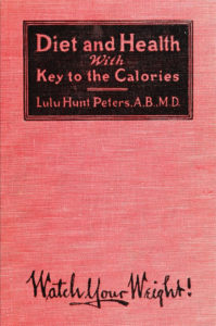
In December, as I was compiling the biggest nonfiction bestsellers of the last 100 years, I noticed a diet book pop up multiple times in the 1920s: Lulu Hunt Peters’s Diet and Health: with The Key to the Calories. Though it was first published in 1918, it hovered in the middle of the list for several years and managed to become the bestselling nonfiction book in the country for two years running: 1924 and 1925. So, I investigated.
Lulu Hunt Peters was a doctor with a popular newspaper column, Diet and Health, which she turned into a book (turns out this isn’t exactly a modern phenomenon). Diet and Health was the first diet book to popularize the now-ubiquitous technique of counting calories for weight loss—and not for nothing, in it Peters also argues that dieting is a patriotic act, to which I say: ok. It was an instant hit, and became the first weight loss book to make the national bestseller lists. After reading some of it, I can see why—and it’s not because she makes me feel patriotic. Frankly, she’s a hoot, and so are the illustrations, which are credited to “The Author’s Small Nephew, Dawson Hunt Perkins, The little rascal.” (Imagine a diet book illustrated by someone’s nephew these days. ) So for your own amusement, enjoyment, and/or New Years resolution-ing, I have reproduced the author’s introduction as well as the chapter on exercise, which I thought was among the funniest. I mean, I never knew that hair-brushing counted as exercise, but boy am I glad I do now.
I am sorry I cannot devise a key by which to read this book, as well as a Key to the Calories, for sometimes you are to read the title headings and side explanations before the text. Other times you are supposed to read the text and then the headings. It really does not matter much as long as you read them both. Be sure to do that. They are clever. I wrote them myself.
I have been accused of trying to catch you coming and going, because I have included in my book the right methods of gaining weight, as well as those for losing weight. But this is not the reason—though I don’t object to doing that little thing—the reason is that the lack of knowledge of foods is the foundation for both overweight and underweight.
Article continues after advertisement
I did want my publishers to get this out in a cheaper edition, thinking that more people could have it, and thus it would be doing more good; but they have convinced me that that idea was a false claim of my mortal mind, and that the more you paid for it, the more you would appreciate it. I have received many times, and without grumbling on my part, ten dollars for the same advice given in my office. Perhaps on this line of reasoning we should have ten dollars for the book. Those of you who think so may send the balance on through my publishers.
L.H.P.
Los Angeles, California June, 1918
Exercise
It is practically impossible to reduce weight through exercise alone, unless one can do a tremendous amount of it. For the food that one eats is usually enough to cover the energy lost by the exercise.
Light On Your Feet
However, exercise is a very important feature of any reducing program; not because of the fat that is burned up in the exercise—and there is some burned—but for the reason that it is necessary to keep one in a healthy condition. The muscles, the internal organs, the bones, the brain, are all benefited—in fact, the entire system.
The exercises described hereinafter will help make you fat or thin, and they will keep you supple, graceful, and light on your feet, so that when I tell my husband that he must dance with you, Madam, he will not say, “Nothing stirring,” and when you, Professor, ask me to dance, I will not curse the day I was born.
Warning: If you have not been accustomed to exercise, I warn you to take up only one or two at a time and do each one a few times only. You will be atrociously sore, and you will realize that you have muscles of which you wotted not.
However, persist, if you are sure there are no organic reasons why you shouldn’t—such as a weak heart. (In case you are very much overweight, I think it advisable to wait until you have reduced somewhat.)
It is splendid if you can belong to a gymnasium or to a physical culture class, but ten to fifteen minutes’ systematic daily exercise practiced with vim, and each set followed by deep breathing, will do more good than a gymnasium spasmodically attended. Brisk walking with a long stride isn’t so bad; in fact, if taken with a very long stride it will twist ‘most every organ you have in your body.
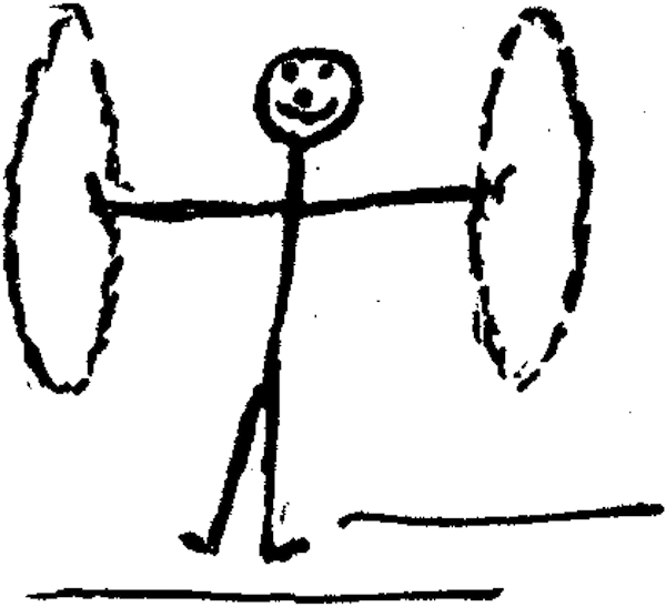
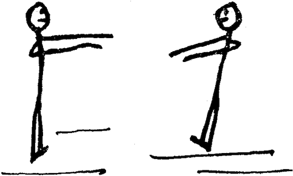
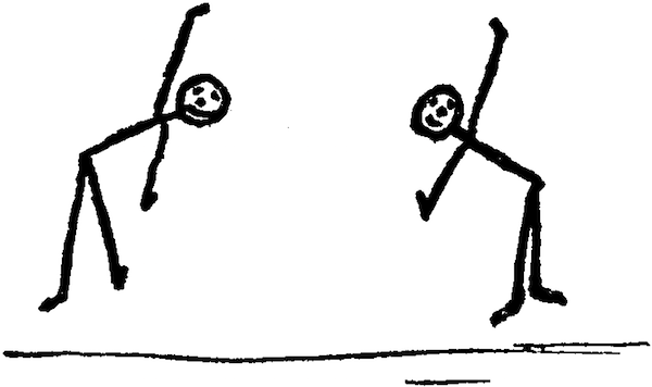
There are hundreds of exercises you can take. If you will notice little rascal’s illustrations you will find many good ones. Those illustrating the beginning of this chapter are excellent.
If possible, it is best to take the exercises on arising in the morning, but if you have a household to care for you may not be able to do so. For those who have to do their own work, it may be well to do the work first. You can do it in half the time if you plan it carefully and speed up. (This advice is not for my thin friends; their speedometers register too high already.) It does not matter so much when the exercises are done as that they are done, and done every day for the rest of your life, with the possible exception of two or three days a month.
Gallstones, permanent stiff joints, and other little things like that will have a hard time forming.
My Exercises
(The services of my noted artist I was able to obtain with great difficulty, as he was engaged in the more important work of making a swagger stick. I finally secured him by the promise of an ice cream cone and twenty-three cents to go with his two cents so that he could buy a Thrift Stamp. He is given due credit on the title page.)
These exercises executed with vim, vigor, and vip—deep breathing between each set—will take ten to fifteen minutes. Re-read my warning.
1. Feet together, arms outstretched, palms up, describe as large a circle as possible. Fine for round shoulders and fat backs. Do slowly and stretch fifteen times. Smile.
2. Arms outstretched, swing to right and to left as far as possible at least 15 times each.
3. Bend sideways, to right and left, alternately, as far as possible at least 15 times each.
4. Revolve the body upon the hips from right to left at least 10 times, and left to right the same.
5. Bend and touch the floor with your fingers, without bending your knees, at least 15 times.
6. Knee-bending exercise, at least 15 times. This is hard at first.
7. Hand on door or wall, swing each leg back and forth at least 15 times. To the side 15 times. Turn head, raise arm, and tense both.
8. Step on chair with each foot at least 10 times. This is good for calf and thigh muscles. After a while you won’t look as though you needed a derrick to get onto a street car.
9. Arms on sides of chair. Come down and touch abdomen. Fine for back and abdomen. Fifteen times.
10. Brush hair vigorously at least 200 double strokes all over the head, N.S.E.W., using a brush in each hand.
(Military brushes are best. If you can’t purloin a set of your husband’s, two ordinary brushes will do.) Now shake out the loose dandruff. This is one of the best exercises and must not be omitted, for it accomplishes two purposes. It is a good arm and chest exercise, and it gives a healthy scalp absolutely free from the dammdruff.
NOW
This for a few minutes, followed by this, the hot preferably at night.
O que faltou nesta discussão sobre Mário Machado foi civismo. Também faltou ética. Não estou a dizer que a discussão foi mal educada ou desleal, significados habituais dessas expressões. Estou a dizer que o Civismo, crucial numa sociedade liberal, foi secundarizado ao ponto da total irrelevância.
Neste contexto, defino civismo como a ética colectiva de uma sociedade, que não é fixada por leis mas por decisões éticas individuais ou colectivas. O civismo determina as nossas atitudes perante o que é comum. Na sua origem, o termo denota a capacidade de sacrifício em prol dos concidadãos.
Parece-me interessante mas muito preocupante que a discussão em torno de Mário Machado, do racismo, do sexismo, da homofobia, do chamado politicamente correcto em geral, se centre no plano da lei, ou seja na intervenção do Estado, e que portanto se insiste em temas como a censura ou totalitarismo. Essa insistência na intervenção do Estado demonstra uma desconfiança, uma descrença quase completa na ideia de civismo.
Pouca gente coloca a discussão nesses termos. Lembro-me de Miguel Esteves Cardoso o fazer, quando defendeu o politicamente correcto como uma forma de boa educação. Ontem, Vasco M. Barreto fê-lo também no Público.
Pelo contrário, enquanto se debateu a ida de Mário Machado à televisão, a discussão resvalou quase sempre para o plano legal, se era proibido pela Constituição portuguesa, ou se era legítimo defender que não fosse, porque atentava à liberdade de expressão. Quando se saía desse plano, a argumentação tornava-se vaga. Perguntava-se se era realmente interessante ouvir Mário Machado, se tinha algo de novo para dizer. O problema era colocado como uma questão estética, de gosto, ou talvez até de consumo: como espectador, não me interessa ouvir pessoas como Mário Machado nos meios de comunicação.
É natural que se assuma essa postura dentro de um esquema liberal: por um lado, acredita-se que o Estado não deve censurar todo o tipo discursos, e perante um problema destes, a atitude do liberal, que acredita na troca de opiniões como um mercado de livre troca de ideias, é a de um consumidor, que apoia ou rejeita noções como se estivesse a avaliar a qualidade de um estabelecimento comercial.
Mas fica a faltar a dimensão do interesse social, do interesse colectivo, público, o civismo.
Das decisões que tomei, as maiores são como sopros, ventos que atravessam, que desfazem as palavras, as que dizemos e as que ouvimos. Só com o tempo é possível nomeá-los.
Num jantar em Lisboa perto do intendente ouvi do outro lado da mesa uma conversa que me nomeou um desses sopros, uma dessas decisões do nosso tamanho. Alguém falava da década de oitenta, de como era jovem, numa periferia qualquer, e de como praticamente toda a gente que conhecia se drogava de um modo ou de outro. De como muitos tinham morrido. Enunciou os nomes, ao que as outras pessoas responderam com outros nomes. Nada de novo. Também tinha os meus nomes. Também me lembro dos tempos da escola e dos colegas que fumavam, injectavam e tantas outras coisas. Mas ele continuou, disse que não tomar parte daquilo se tinha tornado numa questão identitária, crucial. Uma resistência. Não se resistia com um vazio mas com algo que o ocupava. Reconheci ali a minha própria resistência sem nome. Apesar de todas as pressões, fui resistindo. Sem uma moralidade ou sequer argumentos sobre a saúde. Sem impôr a minha decisão a outros. Se era tabaco ou charros, dizia quase sem mentir que era a bronquite. Só ali, à espera dos cafés numa tasca de Lisboa, enquanto os outros fumavam lá fora, é que encontrei um nome para uma parte de mim, que até aí era só uma torção física, um movimento.
Há tanta coisa assim sem nome. A primeira parte das nossas vidas é assim, sopros que só ganham palavras muito depois. Toda a dolorosa construção que é aprender a ser homem é talvez o maior desses ventos. Aprende-se através de piadas, de histórias, de rituais, de obrigações. de agressões, de nomes atirados em todas as direcções, nomes que não se percebe. O «paneleiro» que se atira a outro é uma coisa nebulosa que não se percebe. Talvez venha a consciência muito depois que é o uso aberto, público, desses nomes que define a masculinidade tradicional. O homem, o macho, é o único que pode dar esse tipo de nome. De quem os recebe, espera-se a luta ritual ou real, ou o silêncio. Aprende-se uma certa relação com as mulheres, que se não for cumprida é uma derrota, uma vergonha. Aprende-se.
A construção da identidade masculina é uma subcategoria de bullying. Se calhar até é o bullying quase todo. E desde então que lhe tento resistir pior ou melhor, mesmo quando ainda não tinha um nome para essa resistência. Penso muitas vezes que seria muito fácil ter-me tornado num misógino ressentido, a queixar-se da ditadura do politicamente correcto. Tive sorte. A identidade masculina dominante era algo que não me era confortável. Não sei porquê. Se calhar porque na minha família há mais mulheres. Se calhar por o meu pai ter sido criado por mulheres. Não sei.
Tenho a convicção que dos maiores problemas actuais é acreditar-se que se pode apagar a identidade masculina dominante sem erigir nada em sua substituição. Acredita-se que se pode dispensá-la. É esse vazio que os extremismos têm vindo a ocupar, nem digo apenas a alt-right, mas também a direita «clássica», o novo fundamentalismo islâmico, etc. Tudo marcado por uma misóginia identitária que deveria ser um alerta muito forte.
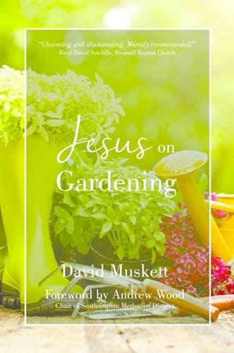
It’s time for the annual Diagram Prize for Oddest Book Title of the Year. First conceived at the Frankfurt Book Fair in 1978 in order to “stave off boredom”. The inaugural prize was awarded to Proceedings of the Second International Workshop on Nude Mice (University of Tokyo Press). Other notable winners include: How to Avoid Huge Ships (1992), Greek Rural Postmen and Their Cancellation Numbers (1996), Managing a Dental Practice: The Genghis Khan Way (2010) and Goblinproofing One’s Chicken Coop (2012). Last year’s winner was The Commuter Pig Keeper.
Here are your 2018 finalists:
Joy of Water Boiling, by Christina Scheffenacker
Jesus on Gardening, by David Muskett
Are Gay Men More Accurate in Detecting Deceits? by Hoe-Chi Angel Au
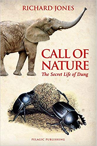
Call of Nature: The Secret Life of Dung, by Richard Jones
Equine Dry Needling, by Cornelia Klarholz and Andrea Schachinger
I’ve been thinking about covers that feature one form of redacted text or another for a while, but this post has been sitting in my drafts folder gestating for far too long so I’m publishing now, as-is, because otherwise it is unlikely to ever see the light of day!
The covers of Censoring an IranianLove Story, designed by Peter Mendelsund, and Nineteen Eighty-Four, designed by David Pearson, are classics of the genre:
I thought that this kind of bar redaction (is there a technical term for it?) might be a relatively new — post-The 9-11 Commission Report — phenomena, but (friend of the blog) Richard Weston, AKA Acejet170, recently posted this 1974 Penguin cover for Academic Freedom by Anthony Arblaster, designed by Omnific, on Instagram:
In a lovely design touch, the redacted words appear on the back cover:
Related to bar redaction is the strike-through. One of my favourite examples is Barnbrook‘s cover design for How to Run a Government by Michael Barber, published by Allen Lane.
How to Run a Government by Michael Barber; design by Barnbrook (Allen Lane / March 2015)
I’ve been seeing the straight strike-through used a lot recently. It does a neat job of doing two things at once. It allows you to not say something, while also emphasizing that you are pointedly not saying it.
I’ve seen it mostly used for nonfiction (as above), but Janet Hansen recently used the strike for the cover of Amitava Kumar’s novel Immigrant, Montana:
Immigrant, Montana by Amitava Kumar; design Janet Hansen (Knopf / July 2018)
Black text on a white background with a red strike-through is its own sub-genre:
In fact, using red — be it more artistic blocks, strikeouts or scribbles — is a popular way to highlight what is being crossed out:
And generally the hand-drawn strike-through or scribble seems to be the most popular way to cross something out …
Hope A Tragedy by Shalom Auslander; design by John Gall (Riverhead Books / January 2012)
All Our Names by Dinaw Mengestu; design by Isabel Urbina Peña (Knopf / March 2014)
If you have (constructive) thoughts on the matter, and/or other examples, please leave them in the comments.
The Last Word by Hanif Kureishi; design by Jaya Miceli (Scribner / March 2015)
«um homossexual não será pessoa indicada para vigilante noturno num internato de jovens rapazes; uma recém-casada não pode ser contratada como modelo (…) Não vale a pena fazer apelos ao politicamente correto, nem crucificar os estudiosos que se limitem a relatar o dia-a-dia das sociedades: o Direito vive com factos e não com ideologias»
António Menezes Cordeiro, Direito do Trabalho I, Almedina, 2018
A s if we didn’t have enough kick-in-the-teeth bad news hitting our screens this week, the beloved McNally Jackson Bookstore in Soho is reportedly leaving its home at 52 Prince Street. The news, which hit Wednesday, engendered a collective gasp that shuddered its way through all five boroughs of New York City. Though McNally Jackson promises that they are “definitely staying in the neighborhood,” they are moving shop because the rent prices are too damn high.
We don’t have an exact count on the number of bookstores we have left in New York right now, but as of 2015, according to this report by Gothamist, there were 106 bookstores in Manhattan, compared to the 386 bookstores in the borough in 1950. These numbers don’t reflect the number of independent bookstores opening in Brooklyn, Queens, the Bronx or Staten Island, but I remain pretty confident that we’re still below that original number.
While it may be easy to slip into a kind of dangerous daydream of the better days of yesteryear — “when people still bought books” — you shouldn’t do that. Because while buying books is important, that “call to action” distracts us from the real problem. Capitalism is not good for small, low return-on-investment businesses that we need in our community. So what are we going to do about that?
Commercial real estate norms are killing your darlings.
Luckily, we have bookstore proprietors like Lexi Beach, the co-owner of Astoria Bookshop in Queens, New York. In a tweet thread on Tuesday, Beach declared: “At a certain point, buying books from the store you love is not going to be enough to keep it open.” She went on to explain that the bigger problem lies in the relationship between capitalism, the commercial real estate market, and the toxic marriage between the two for low-margin businesses like bookstores.
Ok, bookstore loving friends, here is the truth: At a certain point, buying books from the store you love is not going to be enough to keep it open.
I promise you, there is no volume of business that McJ could have feasibly been doing such that, when the initial sweet deal of a 15-yr lease expired, they'd magically be able to pay market rent in that neighborhood.
The problem is not the sustainability of bookstores. It's the immoral capitalist (is that redundant?) system we've all accepted as normal wherein the composition of your neighborhood is dictated by people who do not actually live there.
“I’ve worked in the book industry for a long time, beginning with a job coordinating author tours at Simon & Schuster, where I was in regular touch with booksellers and events coordinators at bookstores around the country,” Beach told Electric Lit over email. “I’ve watched the landscape for brick and mortar stores change dramatically, a few times over, since 2003. I’ve always known that it’s not a business you get in to make a ton of money.” But, she says, she didn’t fully understand the calculations that go into the bookselling game until opening Astoria Bookshop in 2013. Now, the rest of us can learn from her experience.
In her Twitter thread, Beach outlined further calls to action for community members looking to keep the businesses they care about alive. We list them out here, in order to megaphone this real call to take down the bullies of capitalism with collective action.
Start at the Grassroots Level
Call your local officials. Write letters. Go to town hall meetings. Speak up about the value of this institutions in your community.
So what can you do? Talk to your hyper local elected officials. Community board, city council. Tell them how these locally owned, independently run businesses make your life in their district so much better.
Beach told us that grassroots organizations like the Institute for Local Self-Reliance give her hope that bookstores aren’t going anywhere. So does the fact that “local elected officials here in NYC are recognizing that empty storefronts are a community problem — for their tax base, for quality of life of their constituents, for health and safety — and looking for innovative solutions.”
One thing we can ask for: tax breaks for local businesses. As Beach suggests, there are not many incentives for landlords to keep rents reasonable for locally-owned businesses with low profit margins, especially in a city that continues to live up to its impossibly expensive mystique.
My idea is that landlords who rent to locally owned, independent business should get a real estate tax break. My occupancy costs went up 7% year one because of a real estate tax assessment after I opened.
Invite Small Business Owners for Panel Discussion on Community at Commercial Real Estate Conferences
Imagining the dialogue between bookstore owners and commercial real estate developers at a conference feels like fodder for a scathing short story, but it might also initiate an important conversation we don’t know how to start.
Maybe there is a conference for commercial real estate investors that would accept a panel of small business owners and BID administrators to talk about community?
Ph.D.s in Urban Studies Looking for a Project? We Need You!
I almost want to go get a Ph.D. in urban studies just to start this project.
Maybe some PhD candidate in urban studies wants to write a thesis on the inherent conflicts between a business model that aims for sustainable steady growth (small biz retail) vs one that aims for maximizing return on investment (real estate)
And if none of these ideas suit you — we need more! As Beach writes in another tweet, we need to implement all of these ideas and more. Change is not going to happen in one sweeping gesture, but will require all of us to chip in with the actions we can take on.
Ultimately, Beach is optimistic. Channeling the spirit of Jane Jacobs (the urban studies activist who argued that urban renewal did not respect the needs of city dwellers), she believes these problems can be solved. “I’m hopeful because we sell copies of Jane Jacobs’s The Death and Life of Great American Cities very steadily,” Beach told us. “Her vision of what makes a neighborhood welcoming, safe, vibrant, and sustainable is still so relevant.”
What’s so important about Beach’s Twitter thread is that she houses the debate about bookstores in a much larger conversation about what it means to make our neighborhoods vibrant. Beach is hopeful that her bookstore in particular will go the distance “because Astoria is such an incredible neighborhood. Our customers are so supportive of us, and of the other wonderful small businesses here in western Queens. They are very outspoken about how glad they are that we are here, and quite determined to make sure that we stay for many years to come.”
Because bookstores are more than just book adoption centers. For me, I’ve fallen in love in a bookstore, I’ve met authors who became friends, I’ve pet cats that soothed my soul, and yes, I’ve found books that make me feel a little more whole. Bookstores are important spaces for reminding us that the work of building community is an art that takes time, takes dedication, and takes all of us to make it happen.
I'm just spitballing while I walk my dog and eventually get to work to help with the giant stacks of new releases. There are so many possible solutions to Make Our Neighborhoods Vibrant Again.
“Has minimum wage gone up? Yes. Does my rent go up regularly? Yes,” says Beach. “But I’m part of so many networks of smart people (the American Booksellers Association, Shop Small Astoria, the amazing community of NYC booksellers) who all face overlapping problems. There are solutions to all the questions we have and we’ll find them.”


 Cover design by Alex Merto (FSG, January 8)
 Cover design by Oliver Munday (The New Press, January 8)
 Cover design by Grace Han (FSG, January 15)
 Cover design by Michael Morris (Crown, January 29)
 Cover design by Rodrigo Corral (One World, January 29)
 Cover design by Charlotte Strick & Claire Williams (Catapult, February 5)
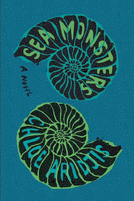
 Cover design by Na Kim (FSG, February 12)
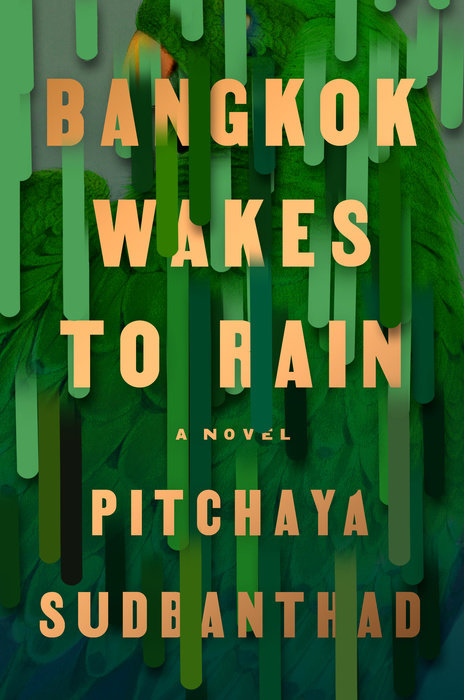 Cover design by Grace Han (Riverhead, February 19)
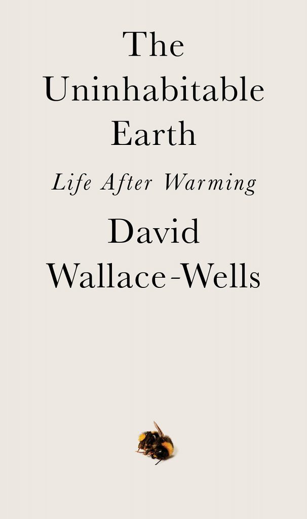 Cover design by Richard Green (Tim Duggan Books, February 19)
 Cover design by Oliver Munday (Doubleday, February 26)
 Cover design by Linda Huang (Anchor, March 5)
 Cover design by Rachel Willey (Penguin Books, March 5)
 Cover design by Alex Merto (FSG, March 5)
 Cover design by Na Kim (FSG, March 10)
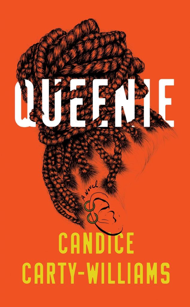 Cover design by Donna Cheng, cover illustration by Gerrel Saunders (Gallery/Scout Press, March 19)
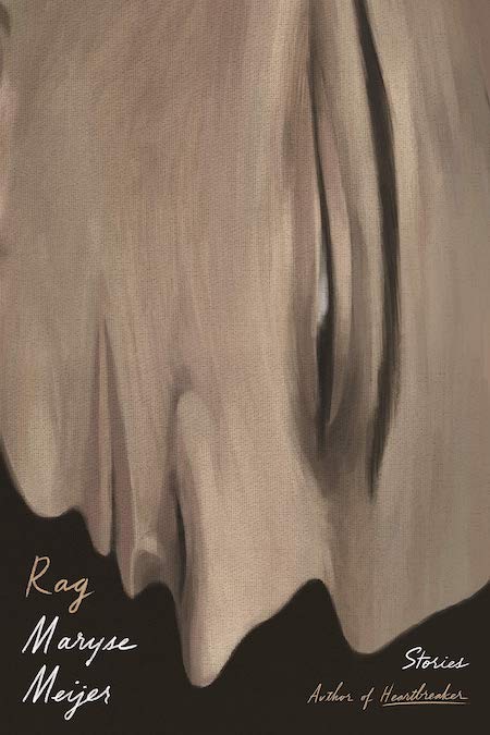
 Cover design by Tyler Comrie (Knopf, March 26)
 Cover designs by Leanne Shapton (Faber & Faber, March & September)
 Covers designed by Rodrigo Corral (Picador, April 2)
 Cover design by Tyler Comrie (Pantheon, April 2)
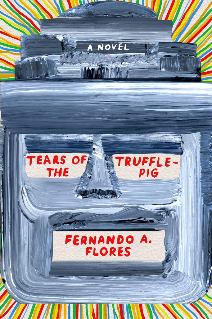
 Cover design by Helen Crawford-White (Head of Zeus, April 4)
 Cover design by Lauren Peters-Collaer (Scribner, April 16)
 Cover design by Elena Giavaldi, illustration by Molly Bounds (Hogarth, April 16)
 Cover design by Jonathan Bush (W. W. Norton, April 16)
 Cover design by Pablo Delcan (Verso, April 30)
 Cover design by Paul Sahre (New Directions, April 30)
 Cover design by Na Kim (Picador Paper, May 7)
 Cover design by June Park (FSG, May 7)
 Cover design by Na Kim (MCD x FSG Originals, May 14)
 Cover design by Lucy Kim (Little, Brown, May 21)
 Cover design by Matt Dorfman (W. W. Norton, May 28)
 Cover design by Na Kim (MCD, June 4)
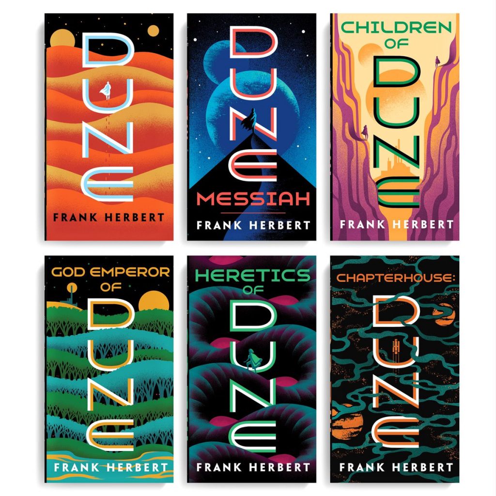 Covers designed by Jim Tierney (Ace Books, June 4)
 Cover design by Holly Ovenden (Penguin, June 6)
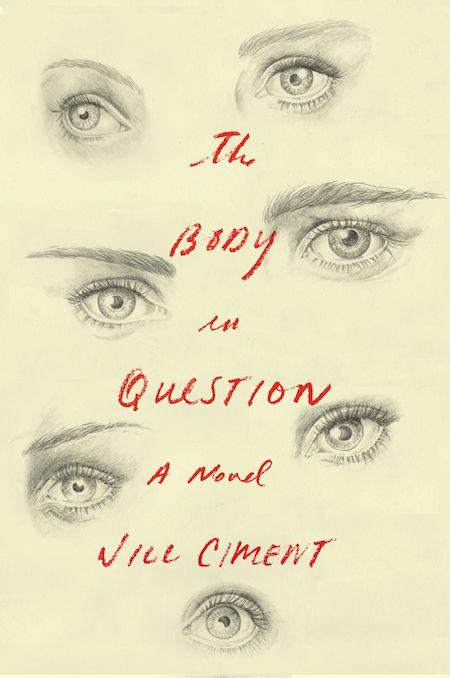 Cover design by Janet Hansen; illustration by Cody Comrie (Pantheon, June 11)
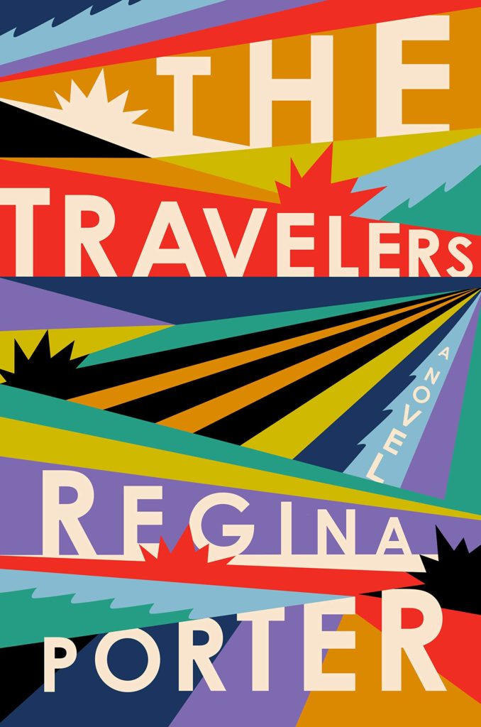 Cover design by Michael Morris (June 18, Hogarth/Crown)
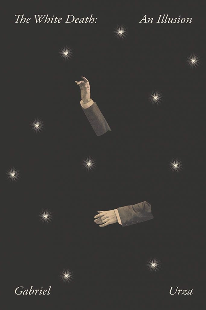 Cover design by Joan Wong (Nouvella, June 18)
 Cover design by Oliver Munday (New Directions, June 25)
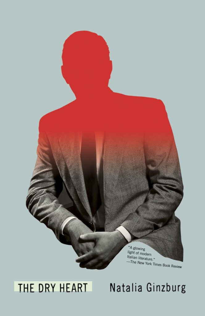 Cover design by Pablo Delcan (New Directions, June 25)
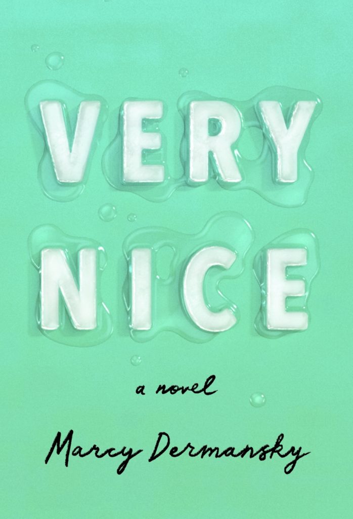 Cover design by Janet Hansen (Knopf, July 2)
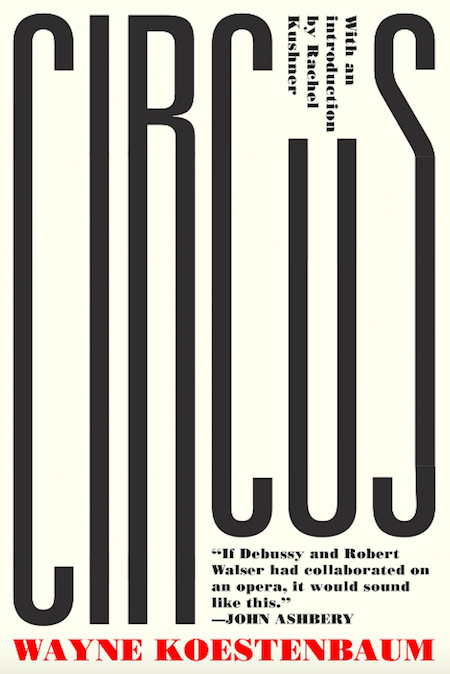 Cover design by Michael Salu (Soft Skull, July 9)
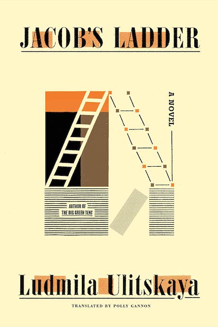 Cover design by Thomas Colligan (FSG, July 9)
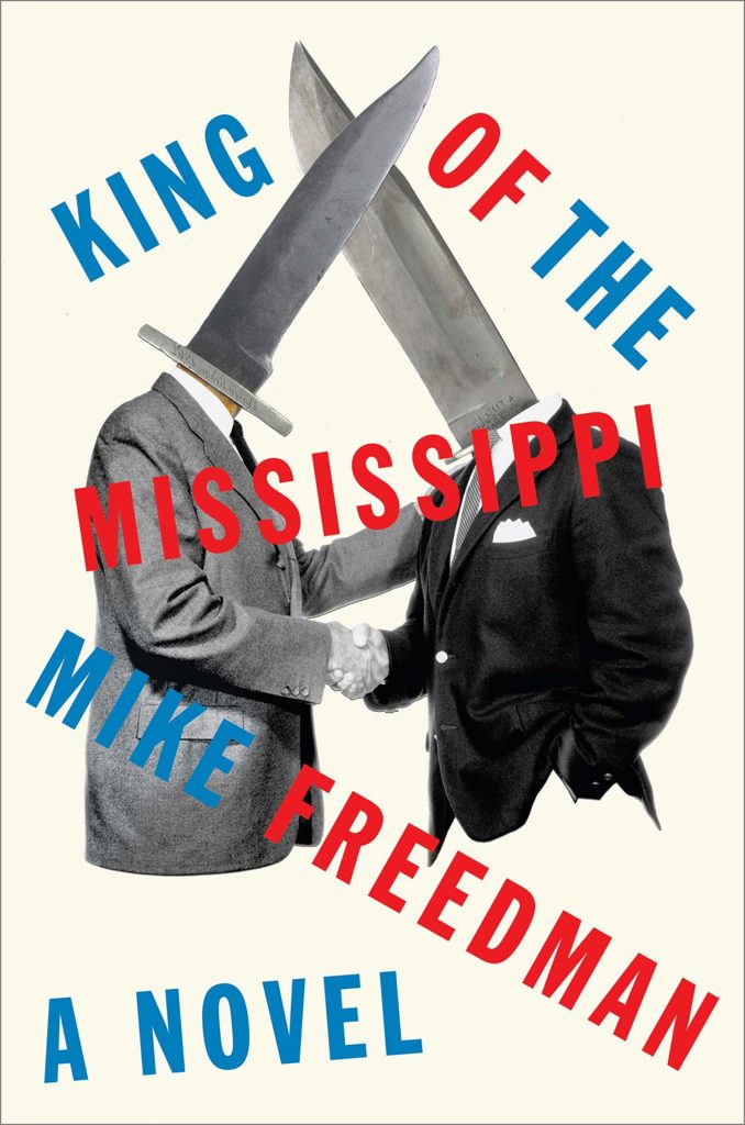 Cover design by Matt Dorfman (Hogarth, July 9)
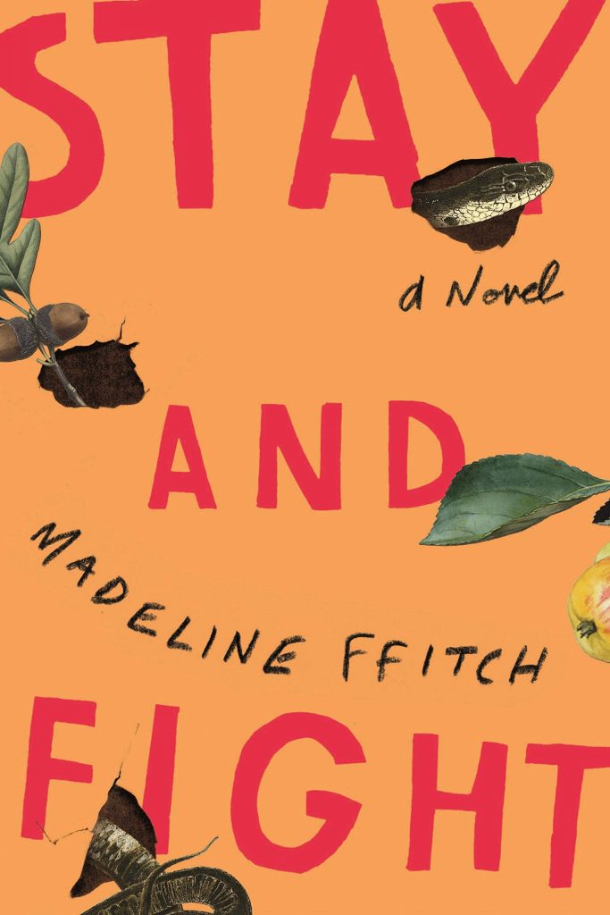 Cover design by Matt Dorfman (FSG, July 9)
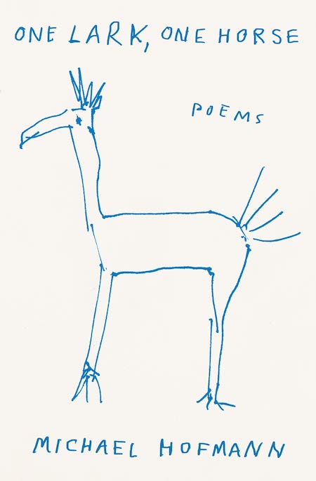 Cover design by Thomas Colligan (FSG, July 16)
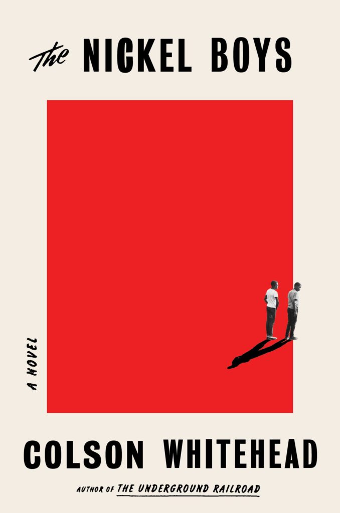 Cover design by Oliver Munday (Doubleday, July 16)
 ” Is he angry? Heartbroken? Pensively dripping with paint? I want the answers to the questions this cover asks!
 1
1


 Over the years we’ve had much to say about the economics of book publishing, from how difficult it is to subsist as a writer to the value of sub rights and beyond. Realistically, we’ve probably spent the most time talking about how Amazon is bad for bookstores, and, well, humanity.


 Light On Your Feet